When I initially started work on this mobile suit, I wasn’t real thrilled with the overall pale green color. The plastic was cast in an almost minty green, and while that may have been the color on-screen in various anime, it was just too bright for me.
I considered switching things over to a more gray color, but for some reason the idea of keeping it all green began to appeal to me. I’m not sure why… perhaps the thought that it looked a bit like guacamole had something to do with it. And who doesn’t like some good guacamole, with a big bowl of chips, and some salsa, and cheese dip, and…
Wait, where was I going with this?
Green… right. 😉

Looking through my paints, I recalled that I’d purchased the Ammo of Mig Green Mecha color set quite a while back. I’d painted little dots of color on the lid of each bottle, to make it easy to see what the color really looked like. Comparing two particular colors to the kit plastic, A.MIG-0082 Interior Light Green and A.MIG-0201 Light Gray Green, I realized those would work quite nicely for the bulk of the armor suit. While it’s cast in one shade of green, adding two lighter colors would help break up the monotony a bit, and yet still retain some of the “canonicity” of the suit.
A few parts were cast in a darker gray/green plastic. A very close match for this was found in the Vallejo Mecha Color range 69.014 Gray Green. The few orange parts would be given a coat of Vallejo Model Air 71.130 Orange Rust, and red bits were treated to Vallejo Mecha Color 69.009 SZ Red, which is a very punchy, bright red. Perfect for the obligatory “shoot pilot here” splash of color in the center of the torso. 🙂
The Dilemma: Color Placement
Of course, having all the colors in hand still left me with a question… where to place them? One of the many sub-tasks that go into the hobby of building scale models is learning where to place certain colors. On historical models, the decision is easy. The real object has already dictated placement. But as I’ve wandered into the realm of make-believe models, I’ve had to face a simple fact that my wife has known for years: I stink at choosing colors. And I’m even worse at putting them together. (Thus my standard wardrobe is jeans and blue shirts… easy peasy.)
And it’s not just choosing colors that I have difficulties with. Where to place the colors in relation to each other is also a skill that eludes me. Even with the help of a color wheel to make sure what colors I do choose will work together nicely, when it comes to putting them together – I may as well be randomly throwing darts.
And the frustrating part is I know it is possible to do so tastefully. I see folks like my good friend Lincoln Wright of Paint On Plastic fame doing so with ease. He looks at a model, looks at the colors, and seems to just instinctively know which color goes with what, and then how they need to be placed together. It just works.
When I do it, I feel as if I’m an untrained chimp whose been given several paint buckets, and I just happily spin around sloshing color randomly. (And I’m probably doing a disservice to chimps in that comparison… 😉 )
I had an idea though… a rare occurrence for me. 😉
When I was in the Army, we’d often use camouflage to cover up our bare skin. They issued us these horrid little tubes that had a waxy stick inside, one half being a dark green, the other being a lighter green. The idea was to use the lighter color in the shadows of your face, such as around the eyes, under the chin, etc., and then use the darker color on your “highlights” – cheekbones, nose, etc. The theory was that this would help blend the face into the surroundings.
Of course, the reality is if anyone was close enough to see your face you were probably in trouble anyway. And being soldiers, we typically had a jolly time with it all, painting our faces up in all manner of silly patterns. My personal favorite was a big giant smiley face.
Oh dear, I seem to have zoned out and gone off subject again. Anyway…
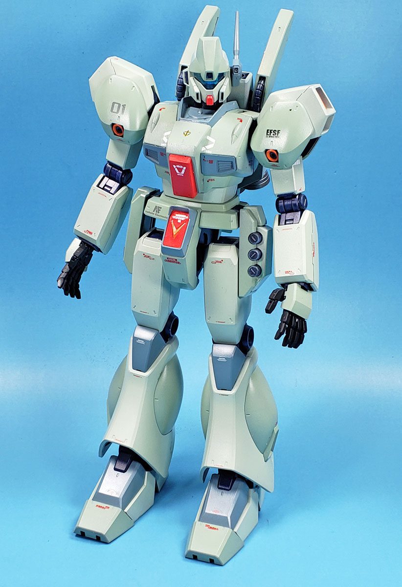
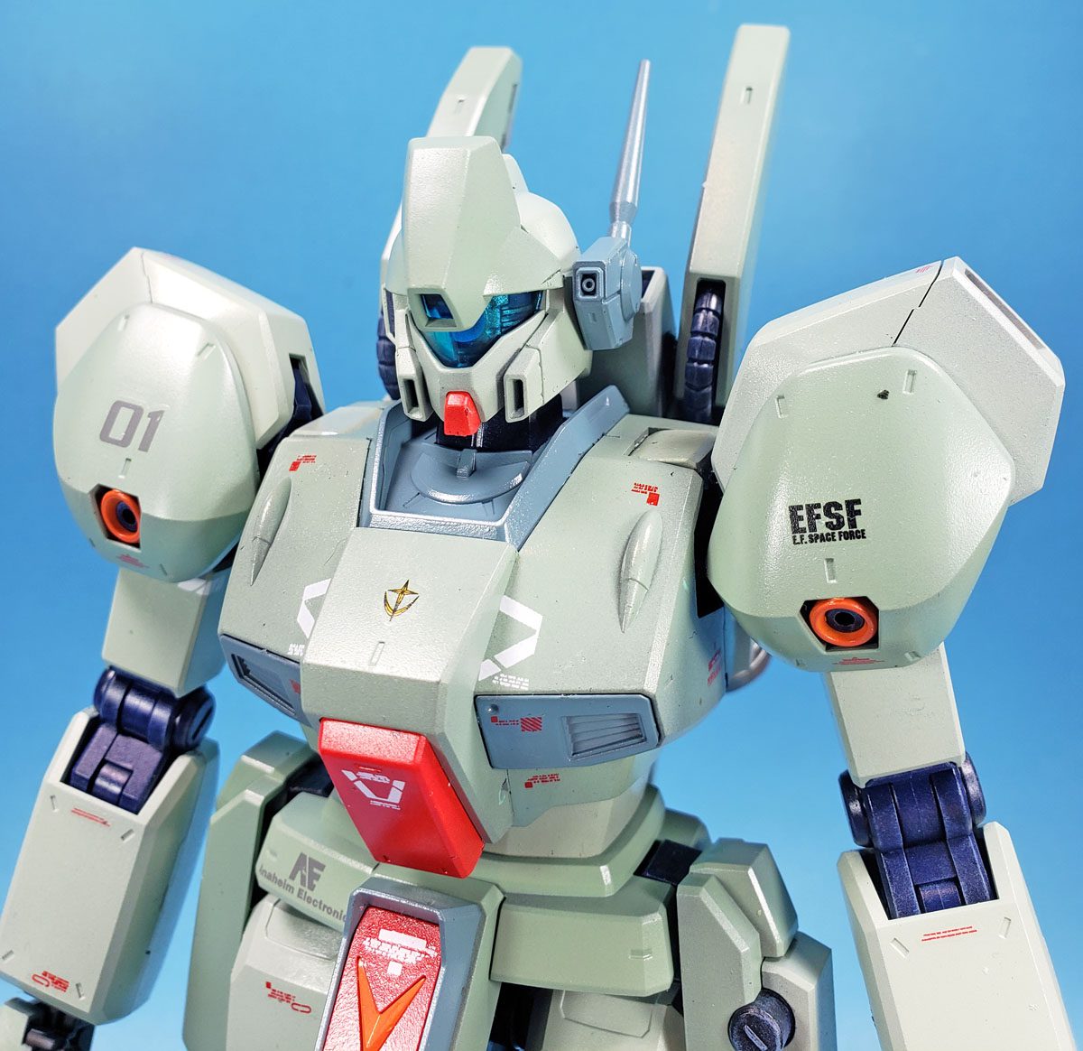
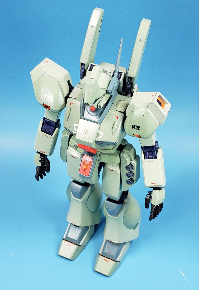
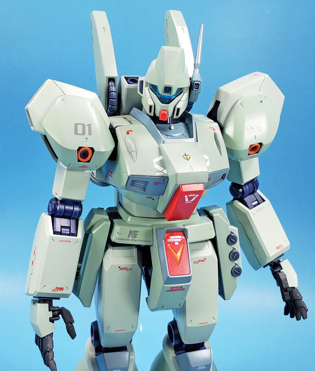
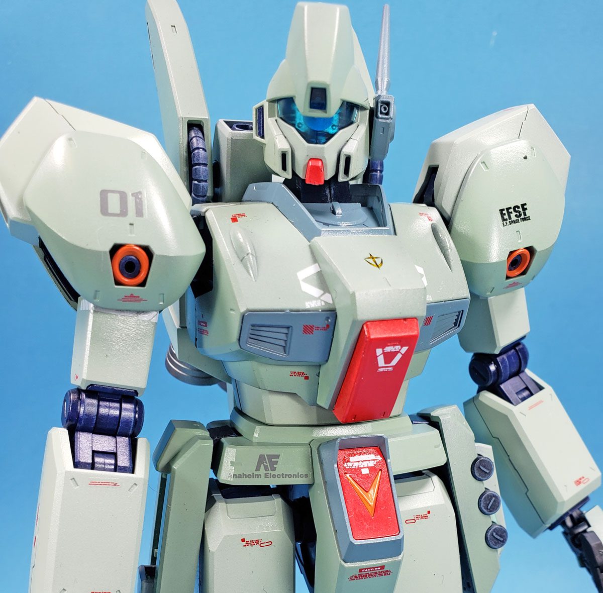
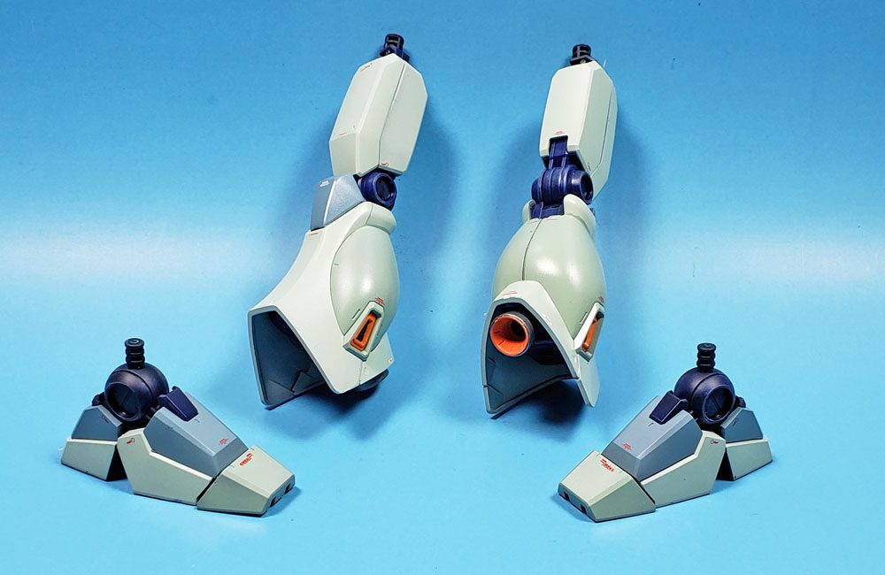
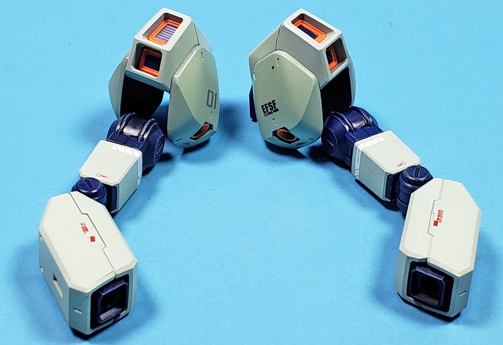
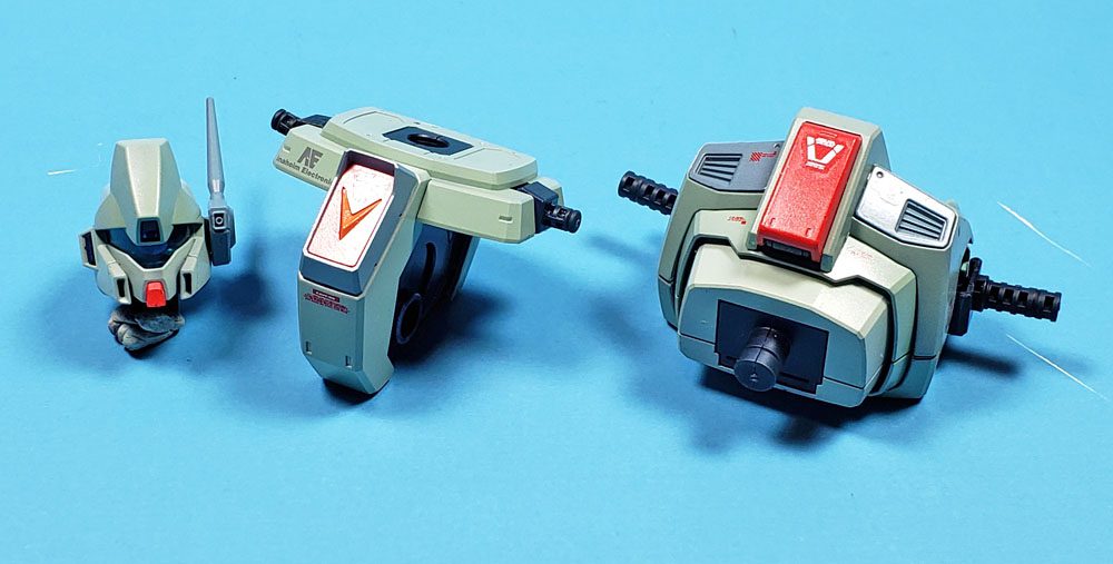
I thought I’d apply a similar principle to color placement, of a sort. I’d pick some of the bulkier elements of the suit, such as the chest and torso, the upper, rounded shoulder armor, and the rounded “calves” of the legs, to be darker. The other elements would be the lighter green. The darker gray/green bits would stay the same.
You may be thinking “well that seems like a fairly obvious approach”, and I suppose you’d be right. However… it was a stretch for me. I’m not the brightest bulb in the knife drawer. 🙂 And after I thought about it, the idea did seem rather obvious. But getting there required an epiphany of sorts. (Oh, dear, he’s epiphanied on the carpet again. Bad Jon! 😉 )
Putting The Paint On
With my epiphany cleaned up, I could get to painting.
I’d mounted all the armor parts on my pterodactyl sticks, which required almost an even 100 to accommodate all the parts. First, I primed everything in Badger Stynylrez Gray primer. I’d considered priming in white at first. Because the majority of the suit was to be in a lighter shade of green, priming in white would mean it would be a little less of a fight to get good coverage and saturation. However… past experience had also shown that when I work with white, my eyes tend to get “snowblind” very quickly. The white color can make it difficult to properly see, as the eye (apparently) goes to great lengths to adjust for the brightness, which in turn gives a poor perception of how well the surface is being covered. On more than one occasion, when painting over white primer, I’d come back later to see that the paint coverage was very blotchy, with patches of the white showing through.
Now, that’s not to say there isn’t a time to prime with white. I always do so for brighter, more primary colors, to retain their “punch”. (I did for the red and orange parts of this kit.) But by switching to a gray primer, I knew my eyes would simply register things better. It took a little more paint, I suppose, but it also meant I reduced my chances of needed to go back for a second coat.
I started the actual painting with the color that had the fewest parts – the gray-green areas. The kit only had the collar area, the antenna mount, part of the waist, and the toe armor in the gray-green. I thought that perhaps adding a few more areas might help break up the swathes of light green, so I also painted the chest vents and the knee armor in the gray-green. For this color, I used the Vallejo Mecha Color paint, and it further reinforced that range as my paint of choice when it comes to dropper bottle brands. It airbrushes on without any fuss, covers very well, and adhere nicely. I highly recommend the Vallejo Mecha Color paints.

Next up were the two shades of lighter green. I’d mapped out my colors using a photo in the instruction booklet, which helped me remember which part needed what color. I started with the darker of the two, as one area of the leg armor would need some masking and then the lighter green added later.
While I do like the color selection and finish of Ammo of Mig paints, they are a bit fiddly to work with. They seem to flow better than any other water-based acrylic paint that I’ve airbrushed, but it comes at a price. To get a good finish, and avoid orange peel, it is essential to mist the colors on, building them up slowly. Unlike Tamiya paints, which can pretty much be blasted on, Ammo of Mig requires a much more refined approach. If the finish is a nice, smooth satin coat, you got it right. If the paint looks a bit glossy, that’s a warning you were getting a bit heavy-handed. Go further than that and you risk orange peel and a bit of lumpiness.
Being an impatient sort – but liking the color range enough to use it with some frequency – I’ve found a “sweet spot” to get it done fast, though it still comes out glossy. I wasn’t too worried about it though, knowing that the next step would be decals, which required a gloss coat anyway. The darker of the two light greens went down nicely (but glossly 🙂 ), and I went straight away into the second, applying it in the same manner. Though I’d not assembled the suit yet, I was already fairly happy with the color choices and layout.
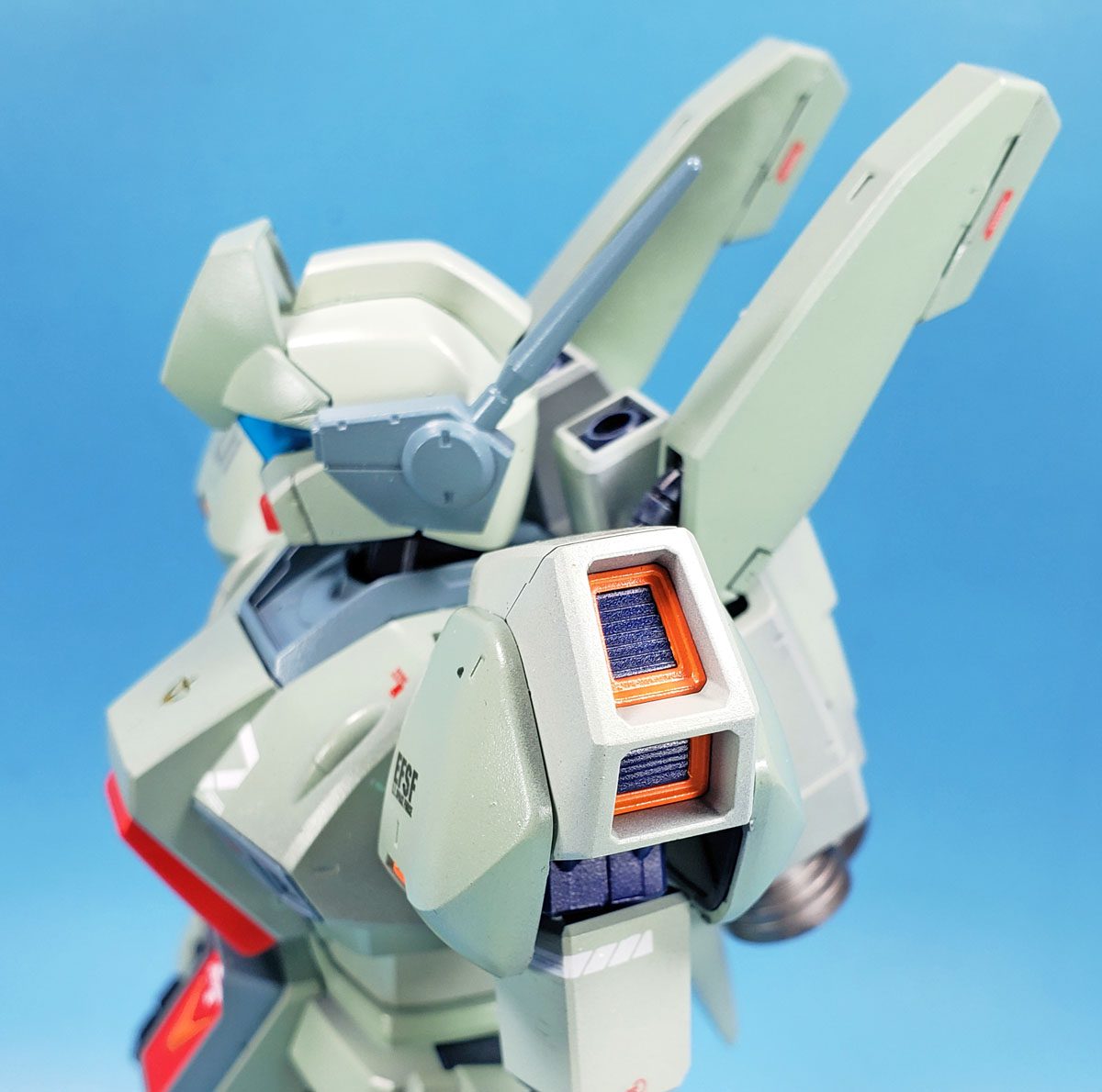
A few remaining bits were treated to the red and rust colors. The kit plastic parts cast in orange were almost the color of Orange Sherbert, which was a bit too “pastelly” for me. I placed a drop of the orange rust paint on my palette, and it looked a bit less comical. However, when I airbrushed it on – it appeared simply like a bright orange. I thought of repainting it, but then realized that later weathering steps would tone it down a bit, and I didn’t want to completely lose the orange color, so I left it as is.
The Gamble Paid Off
In a previous blog entry, I’d outlined my reasons for sticking with Bandai’s color choice of blue for the inner frame. Admittedly, I was a bit unsure how it would look. I’m not a fan of blue and green together without at least some yellow included as a nod to their adjacent positions on the color wheel. Hoping the orange would help make that tie in, when I saw just how orange the rust was, I thought it might lean too far away from a pleasing combination.
As I began to assemble the mobile suits components, all doubt was cast aside. The light green shades, with the dark blue frame in contrast, just seemed to click. They worked together quite well, at least in my mind. (Scary a place as that is.) Even the brightness of the orange seemed to fit when seeing it all together.
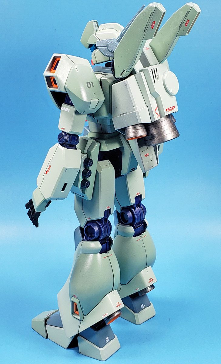
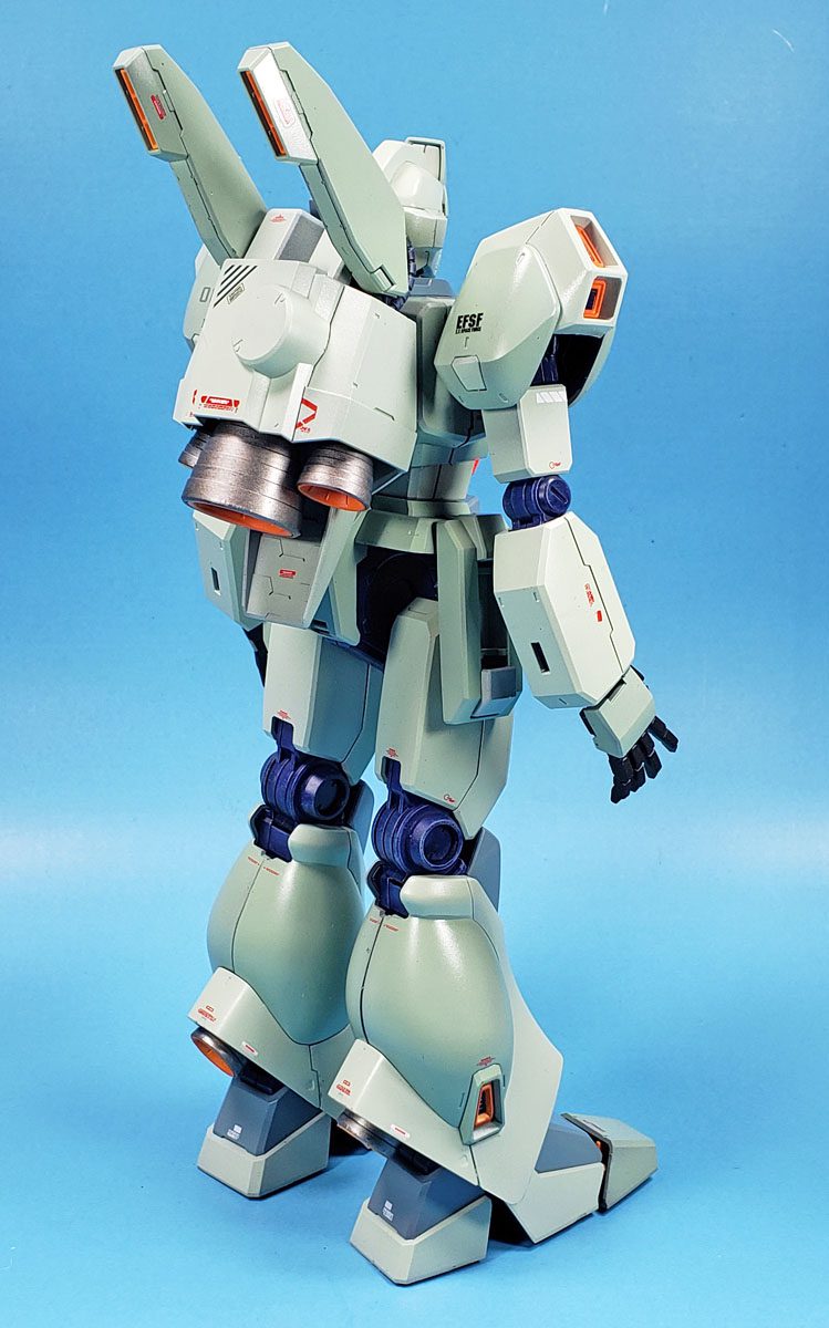
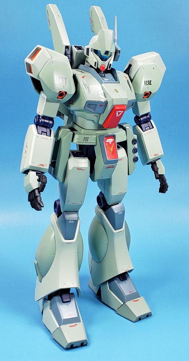
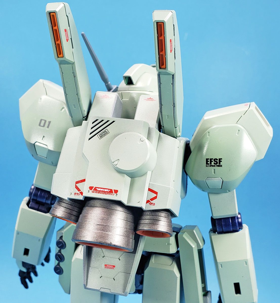
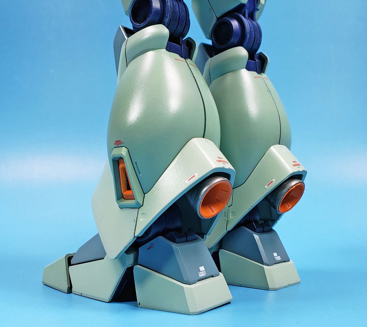
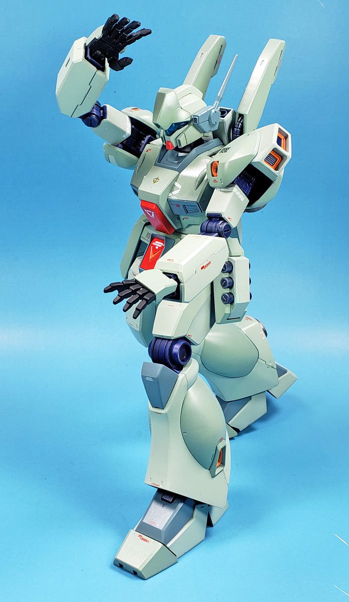
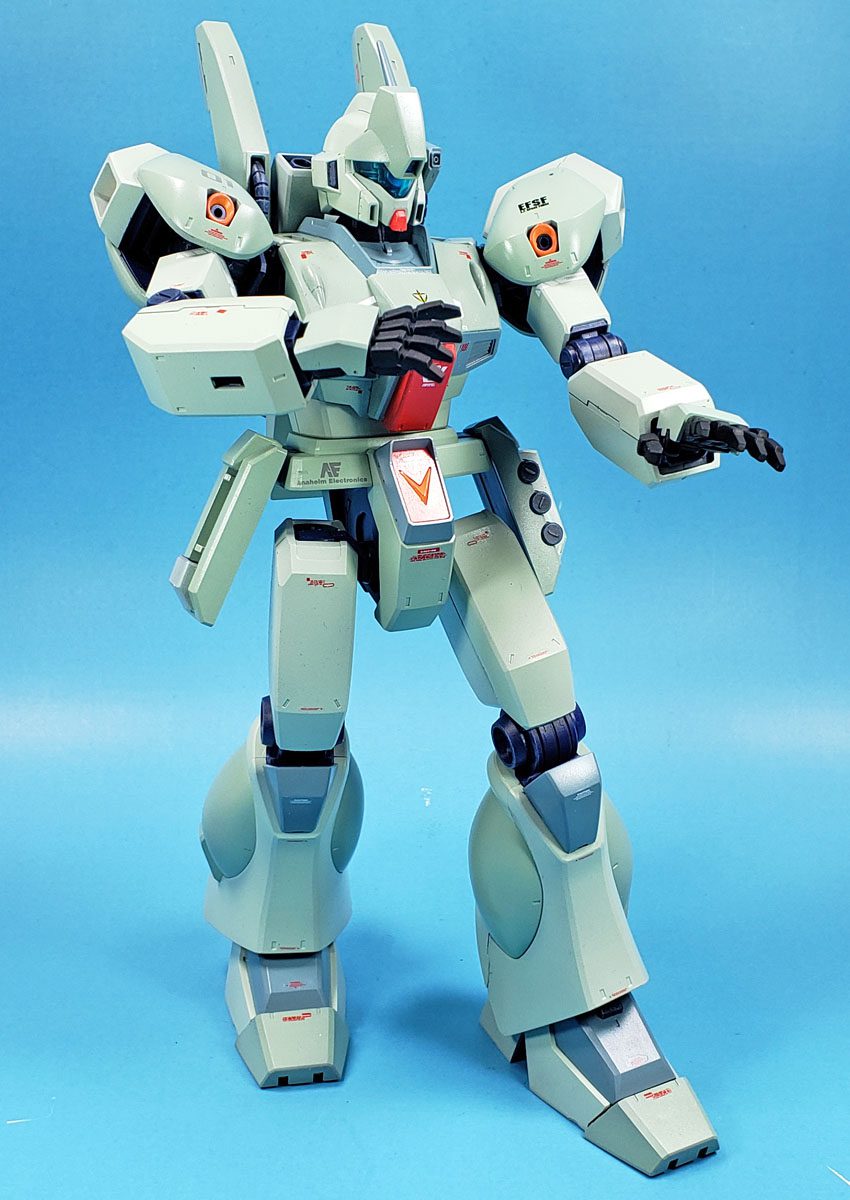
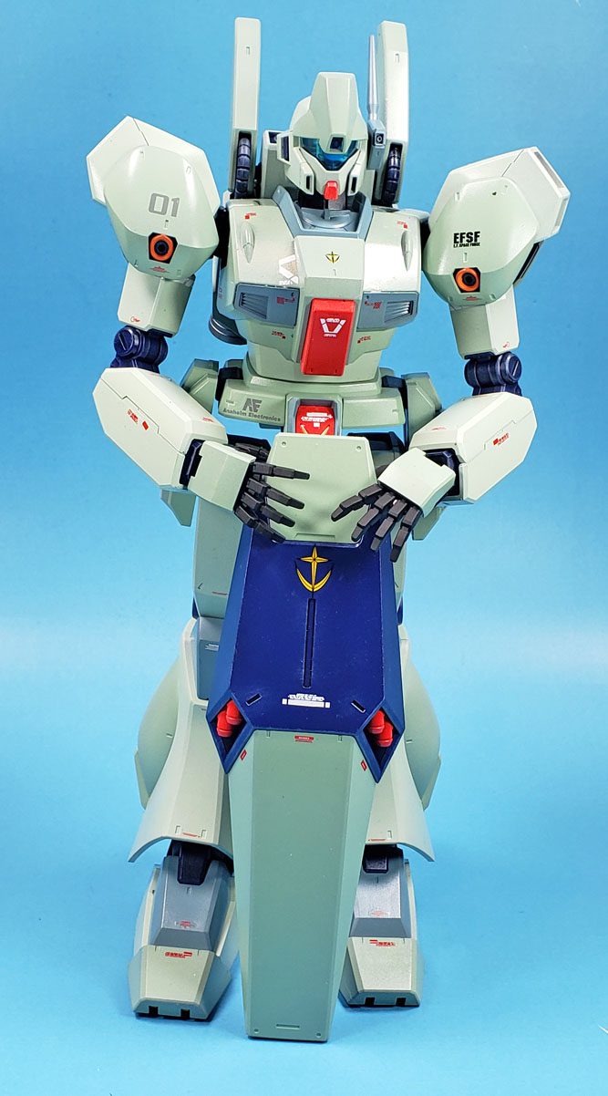
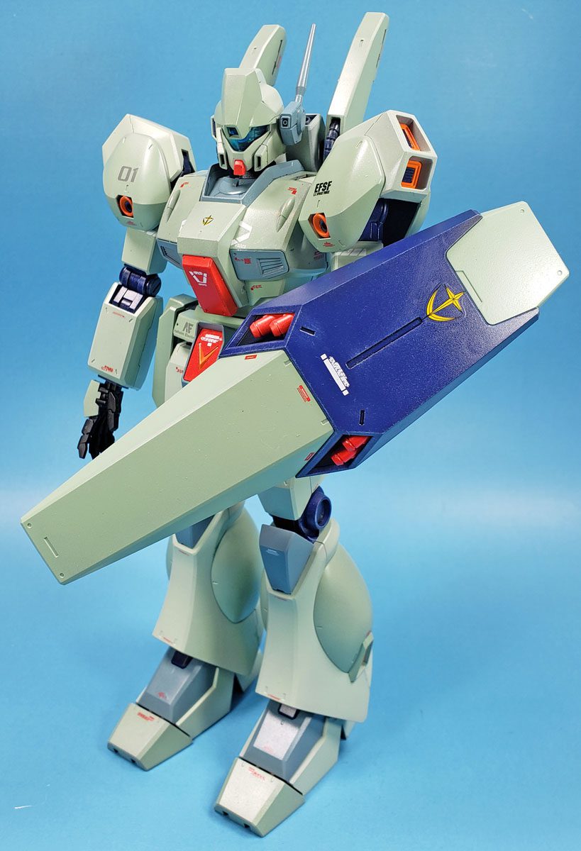
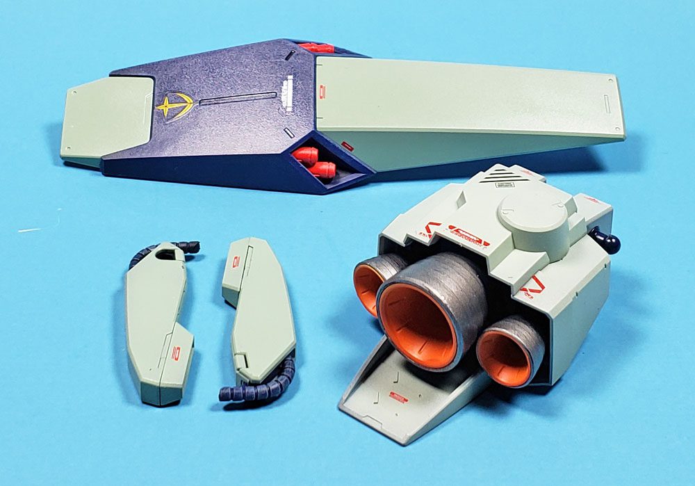
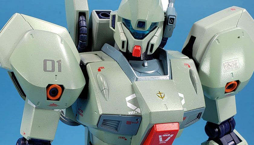
Most of all, I was very, very happy with my color “mapping”. I felt the choices made for a quite logical and pleasing pattern, and did exactly what had been hoped – break up the monotony of the single light green, yet faithful enough to the canonicity of the mobile suit to work.
With all that in place, I gave things a gloss coat of Future, and began the decaling process.
Oh, Bandai… Why No Decals?
If I have any complaint against Bandai, it is the lack of waterslide decals in most of their Gunpla kits. Most come with very high quality stickers, which don’t actually look too bad on the bare plastic. However, if they have weathering over them, the edges are readily apparent.
A few kits comes with dry transfers, but generally it is only a subset of the markings, consisting mostly of ID numbers and a few other general markings.
While Bandai may release separate waterslide decal sets for some kits, I did not find any specifically for this one. So I did what any Gunpla builder with a few painted models under their belts would do – I turned to an ever growing collection of aftermarket decals.
I used a combination of Bandai and some third-party decals from China. The Bandai decals performed flawlessly, and I loved using them. If you’re an aircraft builder, I’d say they’re just a bit down the scale from Cartograph – but not by much. If they tightened up their carrier film borders, and went a bit thinner, they’d be equal to that brand.
The third-party decals were…. awful. I’d purchased them on a large sheet of generic stencils in a variety of colors. The carrier film edges were way too wide, and the decals fell apart at the slightest touch. Because I was running low on the Bandai sets, I had to use them – but it took quite a bit of work. Lesson learned – stick with genuine Bandai.
With all decals on, and the mobile suit was assembled, I loved how it looked. It’s not perfect – no kit I build will ever be that. But it came pretty darn close to the vision I had in my head for how it should look at this stage.
Wrapping Up
The lesson learned as far as color selection goes was actually quite simple – look at it logically, make a few choices, and go with it. In the past, I tried to come up with some dramatic assemblage of colors and layout, and completely overwhelmed my feeble mind. However, by taking Bandai’s initial promptings, applying some odd logic I’d learned in the Army, and then picking some “safe” color choices, I learned quite a bit about the process. I really feel this is part of equipping myself for more sophisticated schemes down the road.
(Or I may look like a doofus and paint a Gunpla like a clown. Stick around… 😉 )
The next steps are of course going to be the chipping, weathering, and other opportunities to ruin what is so far a decent model. I’m not quite sure if I want to go for a cleaner look, or make this one appear completely dogged out and war-weary. Both have some appeal to me… I suppose there are worse things than picking one option, and trying the other on the next Gunpla. 😀
If you’ve been on the fence about this Jegan kit, I can highly recommend it. While the external surface detail is not extensive, the suit itself looks great. It’s a grunt suit that I believe has all the elements that make the genre appealing. And though it is a Master Grade kit, nothing about it is fiddly or frustrating. (I’m staring at you Gramps v3!) Whether you are a seasoned builder, or new to the genre, this kit should be able to satisfy every taste.
And best of all, it’s just plain fun.

Leave a Reply