As I child, I was constantly drawing. Pencils, crayons, markers, pens… it didn’t matter. If there was a surface that could hold them, I wanted to draw on it. Of course, that got me in trouble on more than a few occasions, with my “artistic expression” ending up on walls around the house.
While my mom was not happy with the additional adornment around the house, she also didn’t want to squash my love of drawing and coloring. She dropped by a butcher shop, and after explaining the situation to the proprietor, secured a reasonable order of beef – and a full roll of butcher paper with it.
Once home, she showed me how to set the block of paper on the floor, roll out a section of it, and cut i with scissors. The paper was then stood up on end, and placed in a corner of the room. I finally had an almost limitless – and “legal” – canvas.
So Many Colors
My childhood drawings were fairly happy ones. Green hills, a smiling sunshine, and lots of colorful block houses adorned my landscapes. People rode bicycles, drove in cars, and everyone smiled and waved. And there were loads of fluffy white clouds against the pale blue sky. Bob Ross would have been proud.
And I didn’t mind mixing media at all. I found that I could use colored pencils and watercolor marker to “preshade” things for the crayons to go over the top. At the time I didn’t call it that of course. I just liked the style.
And I had such a selection of colors. The mandatory box of 64 Crayola crayons was just the start. Mom had given me a shoebox to put my markers in, and a large plastic container to stand up all my colored pencils. I literally had hundreds of them, in just about every color that was available.
When Did Things Change?
Somewhere along the way, my little worlds of flowers, clouds, and bright yellow sunshine was invaded. I began to have an interest in military history. When I started school I was introduced to the library. There I found books on airplanes, tanks, and ships – many in full color. And while I had little concept of what “war” was, I thought it all looked so very cool.
My drawings began to change. Fighter planes roared through the skies. Tanks trundled along the ground. Ships sat offshore, firing away at the bad guys. Oddly, the rolling green hills, fluffy clouds in the blue skies, and smiling people on their bicycles remained. Those were odd little battles I drew, full of machines of war… and a dog happily chasing a butterfly.
My mom lamented the shift in focus, of course. Years later, she said initially she was very concerned, but seeing no other signs of any drastic change in my behaviour, she eventually – though reluctantly – attributed it to simply growing up. Boys my age in the 1970s loved machines that went “boom”.
Building The Nemo

Of all the designs that fill the Mobile Suit Gundam universe, I think that anything looking remotely like a GM will instantly gain my attention. The mass produced grunt suit of the Universal Century timeline (and a few others I’m sure), its workman-like look speaks to me. Never the main character, always getting blown up, it still emerges as my favorite.
The Master Grade Nemo, though being an older design from 2006, has one of the nicest inner frames you’ll find. While not quite as articulated as a more modern suit, the high level of “greebliness” makes for a very enjoyable painting experience. And the armor arrangement is such that there will still be detail seen, so effort painting it will not be in vain.
I gave it a simple paint job – airbrush on some dark gray, drybrush it in light gray, pick out some details in various metallics, and give it all a wash of Citadel Nuln Oil. While not the most nuanced way to paint an inner frame, I felt it looked right for the design. He’s not the main character, but always a supporting one. Hero suits have all details fretted over. Grunt suits just need to get produced.
Deciding On A Scheme
One thing I did not really like about the Nemo was its color scheme. The bulk of the armor parts were cast in a bright, somewhat pine tree green, and the rest in a dark blue. All of the exhaust vents were red, and of course the obligatory “shoot here” pilot’s door was red. While I knew that its status as a grunt suit meant it did not receive a fancy, colorful paint job, I felt something different was really needed.
I considered giving it a desert scheme. A rebox of this kit had been released in such a livery as part of a Mobile Suit Gundam: Unicorn boxing. While I do like desert schemes, and the weathering opportunities they provide, I finally settled on a very different approach from my usual.
I’d recently been blessed to be on Gunpla Talk, Episode #50, hosted by Zach Rensberger (ZakuAurelius) and Josh Darrah. One of the topics we discussed was clean versus weathered Gunpla builds. While they both expressed a desire to tackle a more weathered build, I mentioned that I’d never really done a clean build. Even as we were discussing that on the livestream, it occurred to me that the Nemo might be a perfect candidate.
Picking The Colors
I wanted to do more than just a clean build – I felt it needed color. A weathered build can get away with more muted colors, because it is normally the weathering that is the feature. It’s generally easier to weather a model when the base colors are less prominent, as it allows for good contrast.
Yet for a clean model, the emphasis seemed like it should be on the colors, and the placement of them. With no chipping, mud, streaks, and grime to carry the day, the whole of the visual interest must be carried by those choices.
I looked at quite a few photos – not only Gunpla, but animals and flowers. The options are literally endless, of course. Downloading a line drawing of the Nemo from the web, I tested various looks in Photoshop, to find a combination and layout I liked. i realized very quickly that too many colors can overpower the look, and muddle things up a bit.
After wrestling with the options for a few days, I finally decided that purple would be the lead color, and yellow the counter. While purple is not my favorite color, it just seemed different.
Picking The Paint Bottles
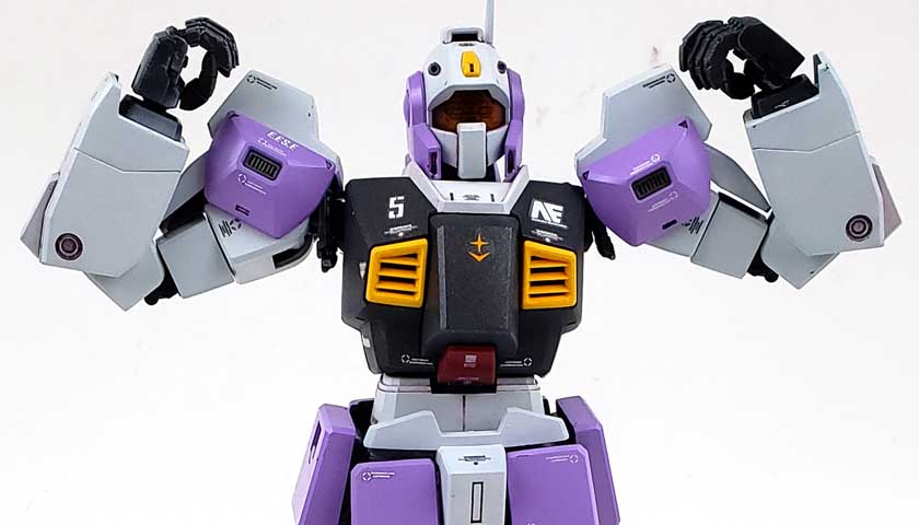
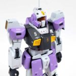
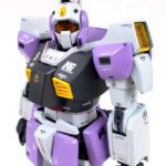
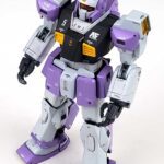
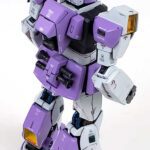
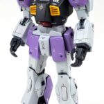
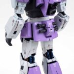
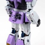
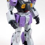
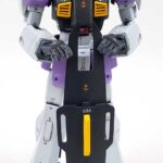
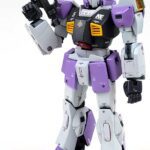
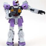
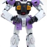
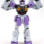
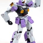
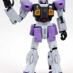
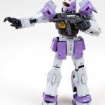
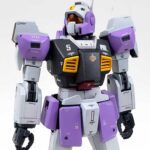
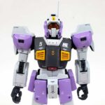
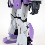
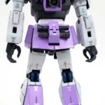
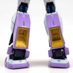
For simplicity sake, my original plan was to stick with mostly out-of-the-bottle paints, I wanted to use three colors from Mr. Colors Gundam Color range: RX-78 Yellow (UG21), MS Purple (UG08), and MS White (UG01). The bulk of the suit would be in the classic white color, and various armored areas treated to the purple. The various vents and a few other touches would be yellow.
The only deviation I’d planned was to paint the bulk of the torso using the MS Purple, darkened up a bit with some dark blue. While I liked that idea at first, the more I stared at my Photoshop mockup, the less I liked it. Because the purple and yellow choices were color-wheel based, I tried to see another color I could add in that would fit. However, doing so would have thrown off the balance.
I briefly thought about black, as that would be a logical counter to the white. Ultimately though, I thought a darker gray look would work, and decided on a metallic from the Gundam Color line, U.N.T.s MS Gray (UG05).
Painting And Decaling
Once the colors were decided, painting was rather easy. As I did not plan to do any pre- or post-shade, and no weathering, only the straight base color need be applied. Because the underlying plastic was very dark, I had to paint the white in several sessions, making sure all was covered. I think the next time I do a scheme like this, I may prime all the parts in light gray, just to make the process easier.
Everything was applied with my Badger Patriot Extreme .3 airbrush, using Mr. Color Leveling Thinner. Air pressure was at my normal setting, 18 psi. As the Gundam Color paints are lacquers, they went on smooth as melted butter. Parts were then given a gloss coat of Future, except for the metallic torso section.
Some Decals
Two things I noted in my research of really nice, clean builds were extra panel lining, and a good number of decals. While I’d decided to forego the additional panel lining for this build, I did have some spare decals.
The bulk of the markings came from a generic Earth Federation set of stencils and generic symbols. I wanted to get a “believable” number of decals on, but not overwhelm the whole suit with so many tiny stencils. I realized that in some way, the small decals improved the visual interest lost by not weathering. Yet I also wanted to maintain a certain degree of symmetry, to emphasize the neat, clean look.
I spent quite a bit more time on these decals than I normally do, but in the end, I was very happy with their contribution to the finished piece.
Wrapping Up
For the panel lines, I used a dark purple mix of oils. Application was very restrained, as I wanted to show the panel line detail, but not make it look heavy or stained. My goal was that the various panels would be noted, but not so much the panel lines.
Final assembly was a bit precarious. Trying to maintain a clean look, while avoid scratches during assembly, was a bit nerve wracking. I had to go in to a few areas and make touch ups. Yet as I examined the photos of the final model, I still spotted a few areas where the dark plastic peeks out.
In the end, I was really happy with this “experiment” of a clean, colorful build. I learned a lot about planning and handling parts in such a build. It also showed me the value of scribing in additional detail. While I like the color choice, and he overall look, it was very apparent to me that some additional detail would have helped quite a bit.
Still, when I finished the last touches, and set it on my desk for the “first look”, I was happy. I think my mom would have liked seeing the colors and the clean appearance. She always did like those earlier efforts I made in my art.
Though this Nemo kit is no longer in production, it is well worth seeking out. Whether you build it canon, pick another more military scheme, or just let your colorful side take over, it is a great palette for some Gunpla fun.

Leave a Reply