More often than I’d like to admit, builds don’t go the way I initially plan them. Sometimes it can be a difficult kit with poor fit. Or perhaps an attempt to use an aftermarket part does not work out well. Weathering steps may not achieve the result I’d hoped for.
And it’s not a case of the final result looking bad, in most instances. It’s rather that what I envisioned for the finished model not quite being accomplished. Of course, even in those times, lessons are learned that are beneficial on future builds.
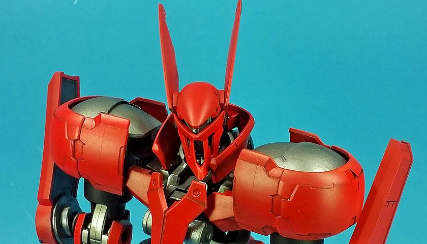
With this Grimgerde, the colors have tripped me up.
I’d planned to alter the canon scheme, going with a look that incorporated far more white, less of the red, and used black as an accent. I didn’t want to approach it in haphazard fashion though. A search of the Googles turned up a decent line drawing of the mobile suit, and I opened it up in Photoshop to experiment with some colors. Yet try as I might, I could not put together a scheme l liked.
Creating a custom color scheme for any model is an art. Certainly a modeler can just paint it, with no great amount of thought. Yet in examining why a scheme works, it quickly becomes apparent that to blend the form of the Gunpla with colors placed in a winsome fashion is no simple task.
One approach I’ve used is to rely on Bandai’s choices, and just swap colors out. This can work well, though even that method does need some nod to a color wheel to make sure the chosen the palette works well together. Still, that’s not too difficult a task, and the results can be quite pleasing.
But to strike off alone, so to speak, and derive a truly custom scheme, eluded me as I swapped out colors in my Photoshop mockup.
The key problem was that of balance. I wanted a suit that featured more white, much as a traditional Gundam would. Attempts to take cues from those didn’t quite look right to my eye, with the culprit in part being how different this mobile suit is shaped from most Gundam.
Trying to pick certain areas across the suit, such as the armor skirting, or the arm and leg armor, to receive the red color fell short also. The best I can describe the results I achieved would be “clown-like”.
I even briefly flirted with a complete color change from my original red, white, and black idea… pick a light color on the color wheel, and see what colors play well with that as accents. Even in that pursuit, the problem hinged around balance and placement.
After a few hours of this, I was a bit discouraged. And then another thought came to mind.
It’s a hobby.
In my day job, when I run into an obstacle, I must overcome it, figure it out, or find a way to blast through it. (Figuratively, of course…) Yet in the hobby, normally there is no overriding reason to make things work. Yes, persistence can pay off. But at some point, I had to recognize that the fun was draining away, and the color selection task had seemingly become an almost insurmountable wall.
And then I looked at the box top.
The wall could be blasted down easily. All I had to do was admit that on this day, my efforts to find a color layout that pleased my eye just wasn’t happening. Many things in life demand persistence. Building small plastic models of giant stompy things that are completely made up does not.
Grabbing the parts already mounted up on pterodactyl sticks and primed, I did the US football version of punting and went with the canon scheme. Within 45 minutes or so, the colors were on, and the initial assembly was ready to take place.
The point I’m driving at is this: knowing when to pull up stakes and move on with any particular project can often be the point of injecting the fun back into it. Making that decision brought this build back into focus. Now that the primary paint is on, I can start the weathering process, and make the decisions needed there to “tell the story” I want the end result to convey.
And the process that ultimately did not work out was not a waste of time. I actually learned quite a bit about the process of good color selection, and achieving a pleasing balance and layout on a model. Much of it was realizing what did not work, but I feel I did have some wins in the process too. Even though they did not work on this model, it will pay off on future kits.
As to the kit and the build thus far, no complaints whatsoever. It’s Bandai… things just fit. If anything, I was amazed at how well planned the suit was to ensure an almost complete lack of seam lines. Everything is either hidden, or deliberately engineered to appear as panel lines. I wish every kit was this way!
I haven’t settled on a weathering plan yet. I think the bright red might look nice with a minimal treatment, yet I’ve also thought it might look good to go to the opposite end, and really weather it up.
I’ve always found it difficult to weather red models. Maybe I can have a win there? I just need to remember not to get too hung up on that! 😉


Leave a Reply