I’ve written about it before, and I’m sure I will again. Experimentation is the key to growth for a modeler. Tackling new kits, products, and techniques may seem a bit intimidating at times. Yet pushing through those fears is how new things are learned.
Part of my own education has been a recent focus on Wave Maschinen Krieger model kits. Because of their scale -1/20th – they allow a great deal of freedom for big weathering. No need for worrying about small-scale realities. These models scream “go big or go home.” And that makes them quite fun.
Overcoming Doubts
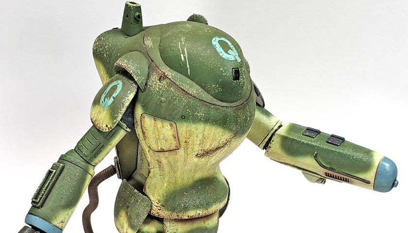
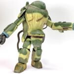
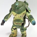
Prior to taking some Christmas and New Years vacation, I’d gotten the Raptor painted up and decaled. When I finished that process, I wasn’t sure if I really liked the colors. I’d initially liked the idea, having been inspired by Lincoln Wright’s build of a Seapig on his Youtube channel. The light yellowish color had a certain appeal to me, even if the tactical, Army trained side of my mind was lifting an eyebrow. 🙂
But having been away from the kit for nearly two weeks, looking on it with fresh eyes made me doubt my choice. I still thought the idea was cool. And I liked Linc’s execution of it. Yet as I looked the model over, I really wondered why I thought I could pull this off.
Of course, I only had two choices, when it came right down to it. Paint over it all and start again, or simply drive on. The former didn’t really appeal to me, for a couple of reasons. One, I’d done the very same thing with the New Rally Pawn, another Maschinen Krieger kit I’d recently built. Dislike of the initial paint job resulted in a do-over – and the resulting loss of time. And while I try to keep my hobby work fun, I have rolled it up into this blog, and I try to publish regularly. So starting over didn’t really appeal to me.
The second reason was a little more practical. I’ve always been a (reluctant) believer that obstacles are simply opportunities to excel. I’ll admit, I hate it when people say that to me. I hate it when I say it to other people. Yet in the final analysis, I know that some of the significant growth in my life – hobby or otherwise – has come when I simply had to make do as best I could and just keep moving forward.
So the choice seemed really simple. To quote one of my Airborne School instructors… “drive on, Airborne. Drive on.”
Driving On
Having decided to move forward with my bright yellow stompy robot (I knew I should have lightened it up a bit), the question was “how to make the best of the situation?”
Falling back on the old theory that “weathering hides a multitude of sins”, I figured globbing other colors on might hide lemon-like appearance of the whole thing.
As the model was already gloss coated from the decal process, I went right into panel line shading. I’ve more and more come to favor very stark contrast in panel lines. In my airplane only days, I was drawn to such a style, but all the voices around me would shout about “realism”. However, as I’ve delved more into the world of “make-believe”, the fact that it’s my model, and I can play with it as I want, has really taken hold. Forget realism – I want to go for what I think looks cool! 😀
All the recesses and nooks and crannies were given a “double dip” of Citadel’s Nuln Oil Gloss. A few areas were cleaned up using a soft brush moistened with Vallejo Airbrush Thinner. I’ve found I can do this type of cleanup for as long as a half hour after application of the shade, and it comes off fine. One of these days I’ll set up a test to push the outer limit of that. (One of these days… 🙂 )
Chipping was then added using a sponge, and a few brush painted chips. For the lighter, yellow areas, I used a dark brown color, as I felt those would simulate being chipped down to the composite armor layer. (Because in my imagination its composite, not metal… at least for this build. 🙂 ) The green areas received sponge chipping with the base yellow/white color. My thinking there was that the darker green was a later field addition, so when it chipped, the underlying color would be revealed. A few spots also received a one-two chipping color combo of the light and dark color. The decals received some green chips, as if they’d worn off a bit.
Overall, I tried to be a bit restrained on the chips from my typical tendency. I actually went a little beyond what I’d planned, but not so much that it bothered me. When it dawned on me that I was heading down Chiipyville Lane, I simply stopped.
It’s A Double LL, Thus Yay-ho
With all the shadows and chips in place, I moved on to the grimy effects. My choice of “weapons” for this stage was now firmly established – Vallejo acrylic weathering products.
As I’ve mentioned in a few previous blog entries, I’ve been learning to use these primarily for the speed they offer. While there’s nothing wrong at all with the use of enamel or oil based products, if you’re in the boat I am, speed is of the essence. And thus waiting for a day, or a week, for something to dry is just not practical.
When I’d first started using the acrylic weathering products, I had some doubts. I knew that it would take time to learn the process, but even after a few builds, I kept wanting to toss them and just go back to the oils. But I decided to stick it out. And I’m glad I did.
While I still have a long way to go in terms of learning the optimal application methods, I am now fully convinced that any effect that can be achieved with oils or enamels can be replicated with acrylics. How it is done may be different – but it can be done. The total time for application may not be shorter, but the fact that the next layer of weathering is only a 15 second hair dryer blast away is really, really nice.
Llayers upon llayers
Because I am still in the “experiment” stage, I grabbed every acrylic weathering product I had. At the time I was working on this, that was half a dozen Vallejo washes, some grime effects, and a few pigments. (Hopefully the FedEx guy will be on time deliver some more later today!) While I went into this stage with ideas of the results desired, I allowed myself some freedom also.
The key, as I’ve written before, is to fully come to terms with the notion that weathering with acrylics is additive. You don’t put it on and then remove most of it. The properties of the products simply don’t work that way. Rather, they’re added on a little at a time, layered up, building towards the same result than a traditional subtractive process with oils/enamels would result in.
One of the simplest “core” concepts that is foundational is the idea that more thinning is better. Because acrylics dry so fast, very thin, translucent layers work best. So thinning a single drop of acrylic wash with 10 or even 20 times more water is not at all odd, but rather a logical starting point.
Another basic tenant that I’m learning is consideration of the underlying surface is critical. Acrylic products behave very, very differently over gloss and matt surfaces. A drop or two of a thinned acrylic wash on a gloss surface will result in a nice rain spot or oil stain. The same dot on a matt surface may bleed out and make a very obviously painted on blob. Yet that same bleeding can be used to great advantage for other effects, and pigments seem to really thrive on a matt surface.
So experimenting across a wide range of conditions is the key to learning the hole system, I believe.
Getting Down To Specifics
I started with darker streaks, heavily thinned, applied over the gloss surface. I’ve found that my primary tool of choice is a #0 liner brush. It has the narrow point like my favorite round brush of the same size, but because it holds less product, it allows more precise and discrete application.
Initial streaks were simply drawn from top to bottom. I didn’t go fast, nor really slow. Just a deliberate yet random streaking in ways that I thought rain and other grime would go from top to bottom. Because the brush leaves more media at the end of the stroke, I tried to make sure they terminated in areas that would logically see more collection of abuse. This allowed subsequent layers to build up more color in the places I wanted it, yet kept the streaks higher up in a more translucent state. (Additive! 🙂 )
I varied thinning as I went along, seeing how various ratios affected the end result. I’d quickly learned that the initial opacity tends to diminish as they dry, so what may look a bit stark on application will generally tone done a bit. Generally. That’s why being willing to experiment is some important – learning the rules and exceptions will eventually lead to mastery of the method. Or something resembling it. 😉
Darker, heavier application was focused further down the suit, around the feet and lower legs. I was a bit more aggressive here, applying streaks, splatters, and outright stains across the parts. In many areas, I applied several colors in varying layers, often even repeating colors. This helped to avoid a “stacked” look, and kept it all a bit more random.
I also found that mixing drying times helped vary things. Sometimes I’d apply a color, allow it to dry, and then apply another. This achieved a multi-tonal layered look. Yet other times I’d apply a few spots of one color, then a few others, allowing them to mix and mingle. (I even added drops of water to further vary the opacity.)
This probably all sounds a bit haphazard, and in this experimentation mode it is to a certain degree. But as I get more comfortable with the products, certain things are shifting from “let’s see what happens if I do this” to “I want a three tone oil streak here” and simply execute it from experience. it’s all being refined, I believe, to the point that I will (hopefully) be in control, rather than just seeing what random chance brings.
A Different Path
In the end, I was happy with all the streaks and stains and globs and abuses. As more layers were added, a filter effect began to take over, and the garish lemony yellow was toned down enough that I finally liked it. In fact, that in itself was a learning experience. I saw that a brighter, punchier start helped the color to “read” better after the weathering had been put on. Again – experimentation pays off.
As far as the kit goes, it’s quite fun. I can recommend it to anyone. If you’re not familiar with Ma. K – as I wasn’t just a few months ago – I’d suggest just picking a kit that looks cool. Don’t worry about why it looks as it does, or how it should be painted, or even what the “community ethos” is for finishes. Just build it, and paint it, and weather it. However it makes you happy – do it. If you think this Raptor suit looks cool, go for it. You’re literally about 2 hours away from opening the box to being ready to paint.
As for acrylic weathering, I’m certainly not suggesting it’s a replacement for oils and enamels. What I would say is worth considering is viewing them as an addition to your toolkit. They offer a lot, and can be easily combined with other media. Layer oils and enamels over acrylics is quite easy to do. Even the other way around works, though you do need to consider drying times for the under layers.
Certainly, if you have a “need for speed”, acrylics are the way to go.
I’ll continue to experiment, of course. I still believe I’m firmly in the “hey y’all, watch this!” stage. But I know through continued use, and experience, I’ll be able to avoid blowing myself and other stuff up too bad. 🙂






Leave a Reply