One of the problems I face as a modeler is a lack of concern for color accuracy. It’s not that I don’t want whatever it is I’m building to not look like the thing being modeled. But my tolerance for “close enough” is quite high. Far more so than many of the other modelers I know… and they remind me of it quite often. 🙂
I suppose I’ve always been this way. As far back as I can recall, “red” is anything from dark pink to maroon. “Green” covers a wide swathe of hues in my world. Name any color, and I tend to boil it down to very simple terms.
It’s not that I can’t see the difference. Once I took a test to determine how finely my eyes could see differences in color. Though I don’t recall the purpose… something about determining how sane a person is, or some nonsense, I did think it was interesting to examine the color choices.
I went through it…. thirty or so little images. Each image had a background color, and then a number in a contrasting color. The first few were simple – red on green, blue on yellow, etc. But they became more complicated… red on some other red, brown on some other brown. Something resembling greenish mud on something else resembling muddish green.
Yet each time I could fairly clearly see the number. I scored 100%, and achieved some rating I could share on Facebook, which I decided to not do. The whole thing sounded rather silly to shout about. (Thus I write it here on my blog… 😀 )
The Modeling Dilemma
So while I can see color variations fairly well, I have a problem actually caring about it. More to the point… I’m lazy when it comes to color.
Part of it is practical. As I’ve blogged about previously, when you weather a model, the final color the viewer sees can be quite different from the way it started out. Being close at the start is important, of course, But after dot filters, streaks, chipping, fading and shading, weathering powders, and various other forms of abuse to the surface, the resulting color is far different. Even if you started with the exact color, by the end of the process, everything has shifted into hundreds of variations.
Much like a real world object would, by the way. 😉
But as I said, there is a certain laziness to it. No matter how carefully one tries to replicate the colors used on the object being modeled, few seem to agree on what is right. Whether it is the underside of the AVG P-40s, the correct shade of Dunkelgelb, or what color white was actually used on the Star Wars studio models… someone will always disagree.
Manufacturers don’t help either. Each one will double-dog swear on their mama’s grave that their representation of Light Gull Gray (or any other color) is THE correct color. Great detail will be written by the marketing department to expound the copious levels of research put into assuring that the paint in that bottle is the bestest most correctest ever!
Yet spray them all side by side, and every one is different.
Who To Believe
After a few early attempts to actually care about color accuracy, which I failed at miserably, I decided to adopt a hardcore “TLAR” standard. That Looks About Right.
The beauty of setting such a low bar for my tolerance of color accuracy is quite freeing. For one, it makes the use of one of my favorite paints quite easy. Tamiya doesn’t have a very extensive line of colors – in their flat acrylics I think it may be less than 90. And while most modelers agree it is pretty good paint for airbrushing, the same people criticize it for having so few colors that actually come close to matching anything in the real world. And I don’t disagree… in theory.
Yet for the practical application purposes of a TLAR modeler, having 20 shades of gray that match nothing in particular is perfect. Because in that lack of precision, I feel like I can make any of it work if I stick to “meh…. that’s good enough.”
So to heck with the experts, the folks who can look at a black and white photo taken 30 years before their birth, and make definitive color pronouncements. Hand me a bottle of generic gray, or green, or purple. I’ll figure out a way to make it work.
So How Does This Apply To the Viper Mk. VII
I’m glad you asked. 😉
I’ve never actually watched the reboot of Battlestar Galactica. Well… I did watch the first few minutes. Some fellow sat in a room, and this pretty lady came in and made all friendly like, and then things blew up. (Meaning the space station… mind out of the gutter, you! 😀 ) I was soundly un-intrigued. I switched back over to Bob Ross, and promptly drifted off to sleep.
So having never seen BSG 2.0, I had no idea what color the Viper VII was supposed to be. The instructions called for a Model Master color, Pontiac Engine Blue, which I knew right off the bat I was not using. I don’t like Model Master. Period. Or at least the parent company, Testors. They killed off Pollyscale, which had a wonderful variety of paints that I really liked. They then tried to pass off their “Acryl” line as a wonderful replacement, which it was not. And I don’t do enamels.
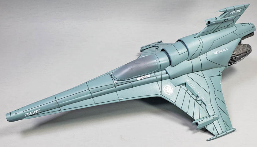
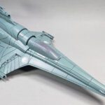
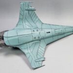
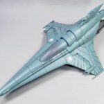
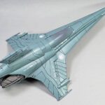
So I looked up the color on the webs of the inter-Google, and my TLAR sensor kicked in. The color looked a bit like Tamiya’s XF-23 Light Blue, which met two important criteria. One, it looked close enough, of course. That’s a given. But two… and this is key… I had it sitting on my shelf.
You see, sometimes color accuracy for me comes down to proximity. Is it in reach? It’s accurate! 😉
The Actual Modeling Stuff
I really like the way Tamiya paints flow through my airbrush. While they can be thinned with alcohol, Mr. Color Leveling Thinner, cellulose thinners, and quite a few other things, I’ve started gravitating back to using Tamiya’s X-20A thinner, which is designed specifically for their paint. The others work nicely, but I find that the X-20A does the best job of leaving the color and finish as is. While the others work, each imparts some degree of subtle change, leaving things either a bit glossy, sticky, or with less than stellar adhesion. Using X-20A alleviates all of these issues.
Having primed in gray, building up the color to full opacity was quite easy. Though I thin my Tamiya paints quite a bit, it only took a few mist coats to get things sorted out. Because Tamiya paints thinned with their own thinner dry very fast, I was able to start on one part of the model, work my way around the exterior, and by the time I was finished with that coat, the next layer could be applied.
After getting that base paint on, I allowed myself a bit of a sneak peek at a few photos of the CGI models used in BSG 2.0. My conclusion?
That Looks About Right. TLAR happiness was reached.
The Decals
While Moebius kits are not known for stellar fit or petite detailing, their decals have so far not been bad. They’re certainly not Cartograph quality, or even Bandai/Tamiya good. However, they are quite usable. The model is supplied with decals for two variants, one from the Galactica, and one from some other ship, the name which now slips my mind. All I knew was it was “Not Galactica”. Figuring that the show’s name is “Battlestar Galactica”, and not “Battlestar Some Other Name”, I went with the familiar.
After having gloss coated the model, I began applying the decals. Dipped in warm water, they loosen up quite nicely from the backing paper, and apply easily. The carrier film is a tiny bit thicker than I’d like, so care was taken to work all the air bubbles out from under each marking. A heavy application of Solvaset followed. I found that allowing the first application to work for half an hour or so, and then following up with another, worked well.
Beside the typical ID markings, there are a few stencils provided also, and these give the model a nice look. If you’re into detailing, adding a few more from a 1/48 or 1/32 scale jet decal set might be interesting. Given that I loathe stencils, though, I merely let the idea slide through my mind as something nice for other modelers to do. 😀
Make Those Lines Pop
My final goal for this stage of the build was to get the panel lines colored. The CGI shots show that the Viper VII appeared very, very weathered, with great gobs of paint chips, streaks, laser blast marks, and very stark panel lines. As I’ve always been a fan of over the top panel lines, it didn’t take any arm twisting for me to dive in.
The wash of choice for this was Citadel’s Nuln Oil Gloss. It dries quickly, and yields a very dark result. I applied it with a #0 liner brush, being somewhat neat, but not terribly so. The gloss-on-gloss nature of things meant it flowed very well, with a loaded brush simply needing to be touched to an area, and the resulting flow often went on for an inch or more.
In a few areas that the wash got outside of the lines, I used a #2 round brush, dampened with Vallejo Airbrush Thinner, to wipe away the un-neatness. It doesn’t have to be done immediately. As I was working through a section at a time – wing surface, fuselage, other wing, etc., I’d wait until a section was finished before cleaning up. In a few areas, I actually cleaned up spots applied earlier in the day. The point being – while acrylics dry fast, they are a bit more forgiving than often given credit for.
With the panel lines shaded, I set the Viper aside to wait on further weathering and detailing – look for it in a few weeks.
Embracing TLAR
If you’re a modeler who really enjoys paying attention to color accuracy, please don’t let me mess with your fun. The joy of the hobby can come from the many different aspects of it. For some, its careful attention to color.
Yet I suspect there are more than a few who become quite tired of the endless search for color perfection, and the often ridiculous lengths that online discussions will go to arguing the point. To those folks, I urge you to consider embracing TLAR.
For one, it squarely acknowledges that this is a hobby that is supposed to be fun. If searching for the correct color is NOT fun for you, take a deep breath, and allow yourself to accept that sometimes color precision may be what’s holding you back in the hobby. I’ve known more than a few modelers who actually never got around to building anything, simply because they were never satisfied with the available colors. So while the idea of building a particular kit seemed very appealing, it sat on a shelf because no one could agree on Dunkelgelb.
A second reason to adopt a TLAR attitude is because these are plastic toys. I know… it’s hard to hear. But it’s true. Accepting that doesn’t necessarily make you a bad modeler. It merely gives nod to the notion that we’re a peculiar bunch, having a great affection for building and gluing and painting tiny plastic objects. No matter how serious you are about it, they’re still just toys.
So have fun with it.
It’s much simpler to live in a world where Model Master Pontiac Engine Blue and Tamiya Light Blue are the same thing. 😉

Leave a Reply