When I’d last blogged about the RX-78-2, he’d received a coat of paint, and was fully assembled. A few days after that, I’d been looking him over, and for a few seconds, considered simply adding panel lining and decals, and leaving him in a “clean” state. But then I pondered on it a bit more…
What fun would that be? 😉
I partially disassembled the model, and airbrushed on a gloss coat using Future/Pledge/Kleer. While I know many modelers don’t consider this a “proper” modeling gloss coat, I’ve always found that it works quite well as a utility coat. It’s cheap, airbrushes right from the bottle, and in hundreds of models that I’ve used it on, found it to be nearly bullet proof. The bottomline for me is it does the job efficiently for just a few cents each time I use it. And at the rate I build, saving money is critical.
The panel lines were darkened using Citadel’s Nuln Oil. While oil or enamel washes can be used, the nature of Bandai’s plastic means that there is a risk of getting thinners in the joins. If this happens, the plastic will literally fall apart. With care, it’s not a problem, but I feel that avoiding the issue altogether with the use of Nuln Oil to be my choice. I applied it with a #0 liner brush, being as neat as possible. In areas that did get a little messy, I went back after allowing a few minutes drying time, and simply cleaned it up with a brush dampened with Vallejo Airbrush Cleaner. This lifts it right up, and the gloss coat protects the paint underneath.
Once all the recesses were lined, I moved on to the decals.
Deep Thoughts On Decals

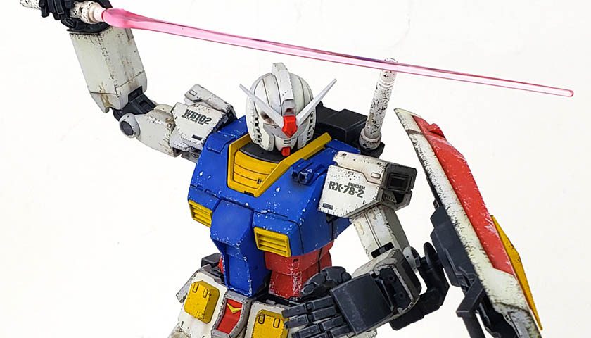
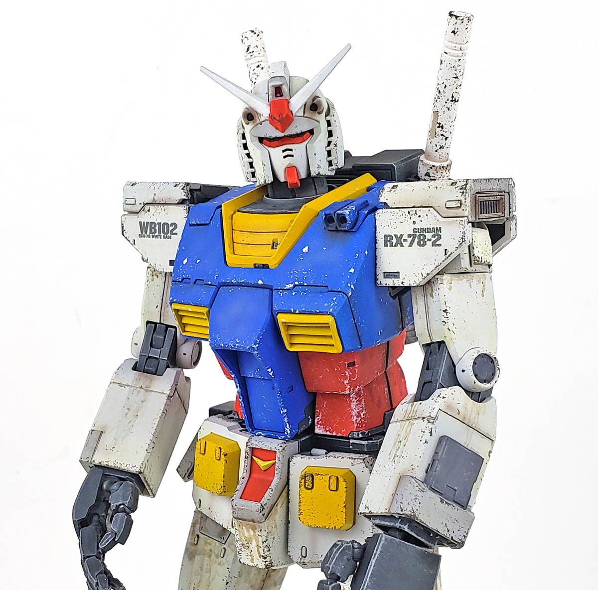
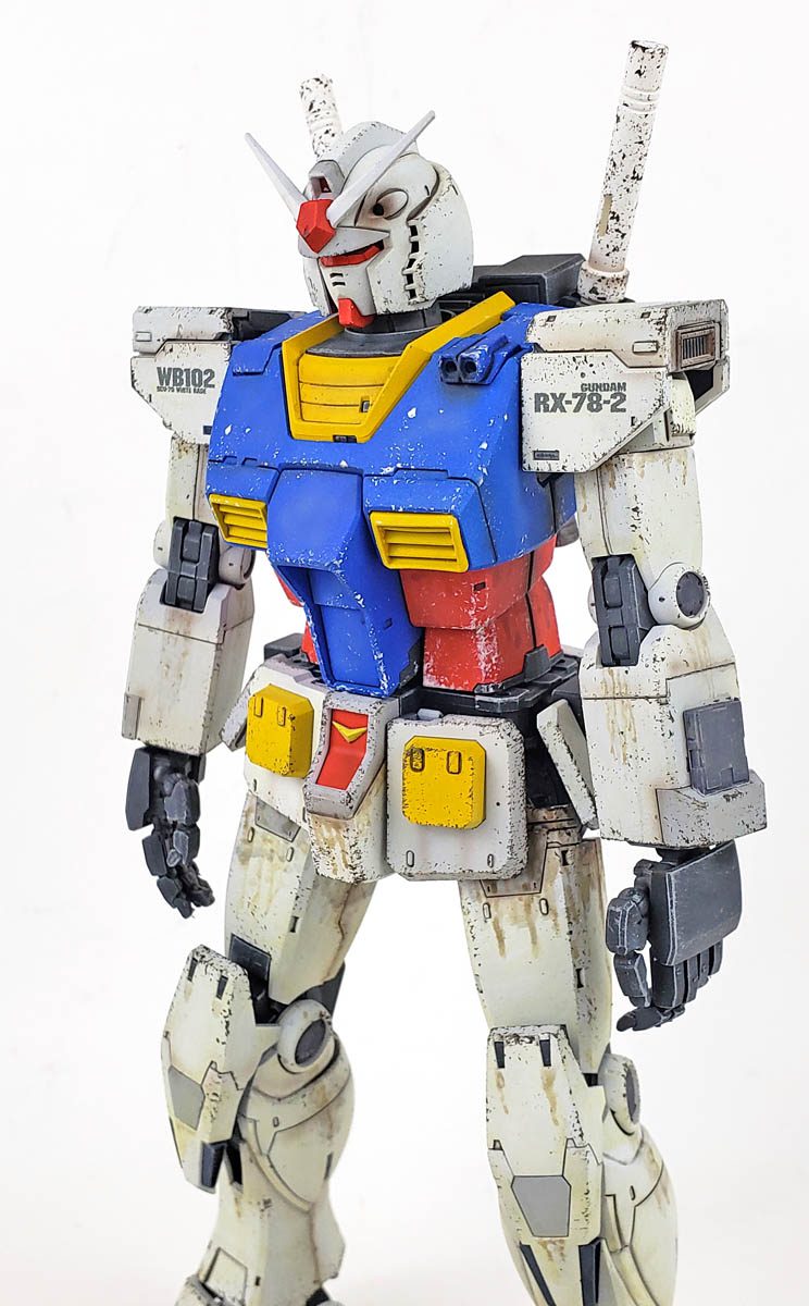
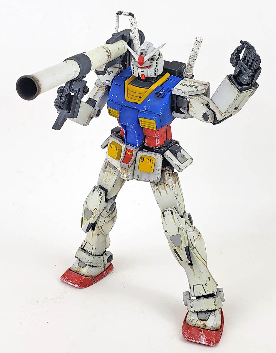
I had a Bandai decal set standing by. Though it was designed for the MG RX-78-2 Ver. 3 kit, I figured they’d work just fine on this one. The set had the usual larger decals, and many, many small stencils. In the end, I decided to apply just four decals – one on each of the forward facing shoulder armor parts, and two on the shield.
My reasons for this were twofold. First, I hate stencils. Period. End of story. That in and of itself is enough I suppose. But I actually had another reason.
If you look at any large vehicle, whether it is a semi-truck, or an airplane, or whatever, close inspection reveals the presence of stencils. They variety is huge – warnings of pressure tolerances, information about what is behind a panel, instructions on how to open things… all sorts of data.
Yet if you step back 100 feet, you see the object relatively in 1/100 scale. The same scale as this model. And for the most part, all of the markings disappear. You will still see the larger markings, of course. But all of those stencils disappear. Why?
Because in reality they are designed to be read by a human from just a few feet away. The lettering may only be an inch tall – if that. And while large concentrations of stencil s may appear as a vague “smudge” at a distance, there isn’t virtually anything that can be read from even 20 feet away – let alone seen at 100 feet.
So while I have used stencil decals on occasion for Gunpla, I’ve started to realize that – in my opinion – they create a problem.
It All Comes Down To Scale
Quite often when I show friends my Gunpla models, they assume it is meant to appear as a man-sized “robot”. (Assuming they are not familiar with the franchise.) When I explain to them that the mobile suits are actually scale models of an object that is presented as 18 meters high in the anime, there is always a bit of a surprise.
So there is a bit of a struggle, from an artistic standpoint, to try to convey the scale. Only in a diorama type setting, with a small human figure next to it, does the actual intended size become clear.
So the presence of loads of stencils, quite visible and even legible to the viewer, tends to “shrink” the model greatly. Because the mind assumes the text to be of the type common of real world objects, the assumption is made that this bipedal object must fit within that same scale.
Yet the truth is, if present on a real world object, in the scale of the decal sheet, some of the stencil lettering would be a foot high. It just doesn’t “fit” to my mind.
So I felt that leaving the stencils off helps to keep the viewers notion of scale more properly aligned with “reality”.
(Plus, I hate stencils. 🙂 )
Back To The Decals
Bandai decals are very good. While not Cartograph quality, they generally conform and adhere well, and respond well to decal setting solutions.
The stickers that come with the kit differ from what is included on the Ver 3 decal set. However, I also had the Ver. 3 Gramps handy, so I used the decal placement guide from that kit.
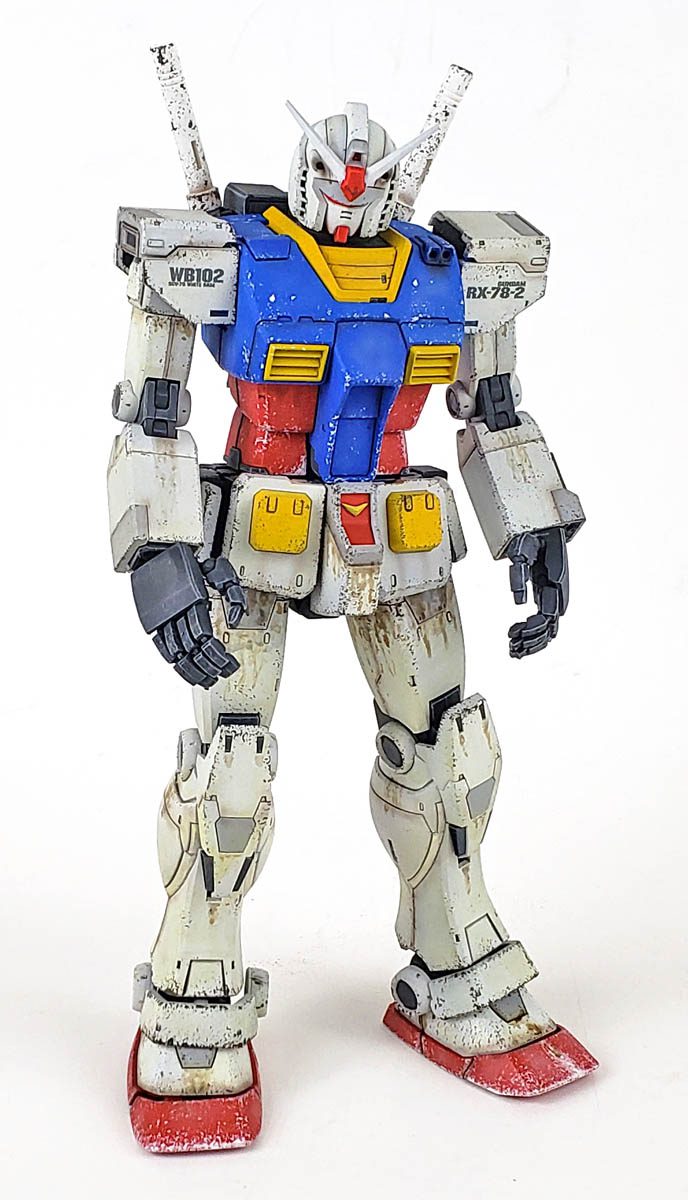
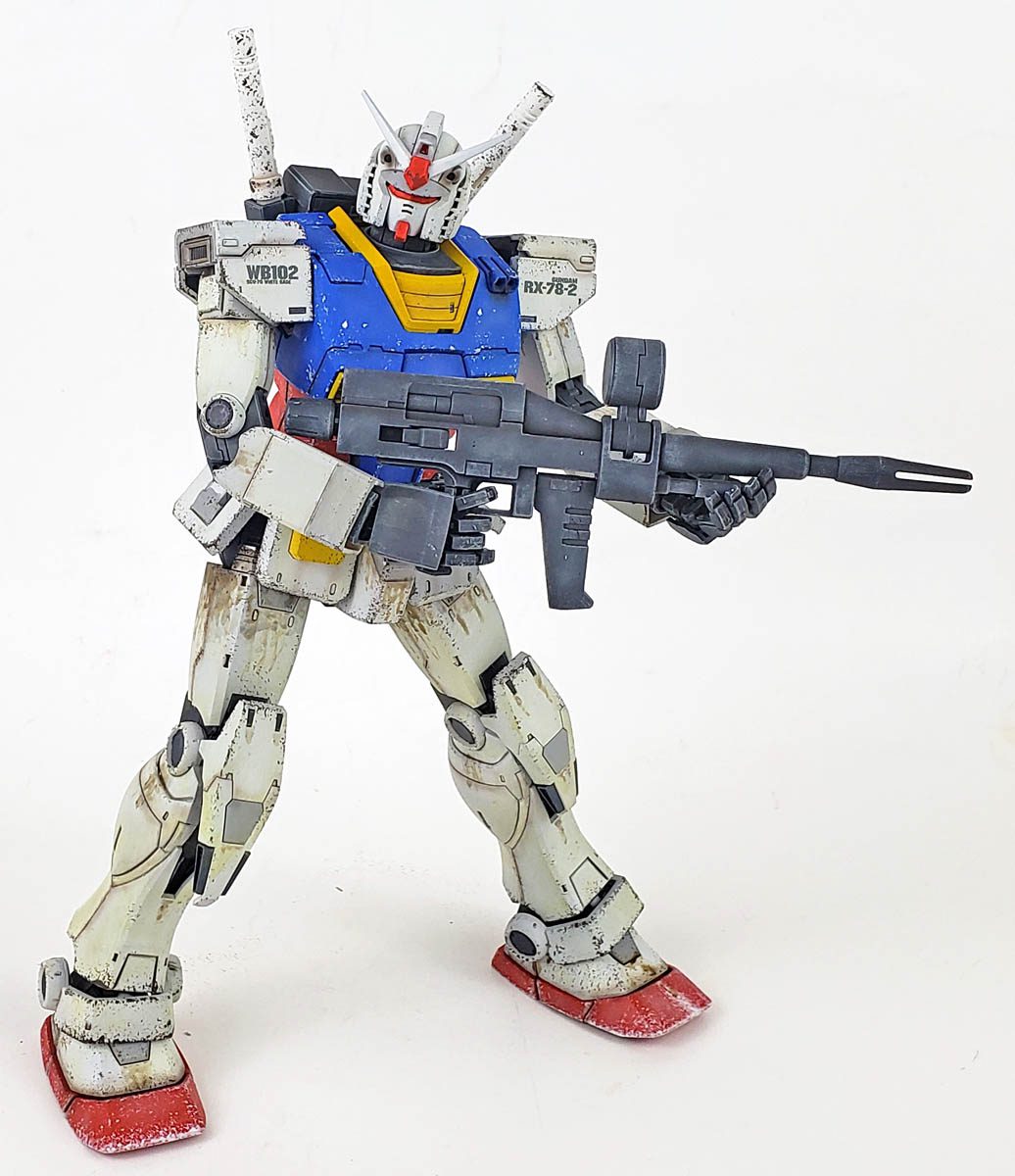
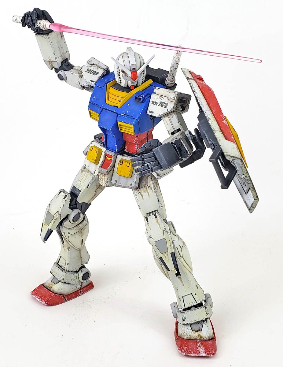
The simple shoulder markings were added, as well as the shield markings. I ignored the tactical problem of giant white lettering on the shield, given that the whole thing is white, red, yellow, and blue. Camouflage these are not. In just a few minutes, the bare bones decal application was finished.
Those Chips
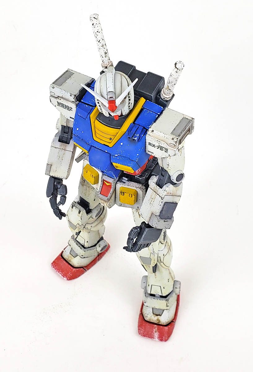
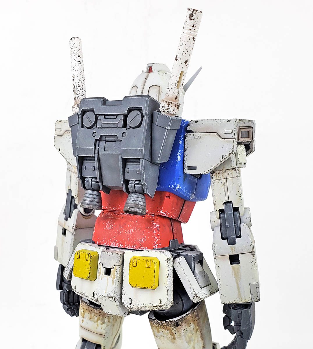
For the chips, I went with the sponge method for application. Using a small (1/2 inch square) section of sponge, held in some tweezer clamps, I applied chipping across the model.
I wanted to have chipping that would be “light to medium”. I suppose that is a bit of an arbitrary designation, but in my mind it fits. (Which is a surprise, given the number of monkeys and llamas running about loose in there…) I wanted to be sure that the volume of chipping gradually decreased as the eye proceeded further up the suit.
Light Chips

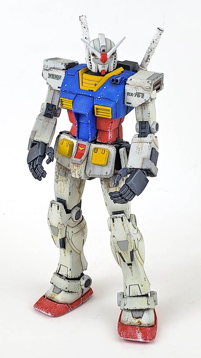
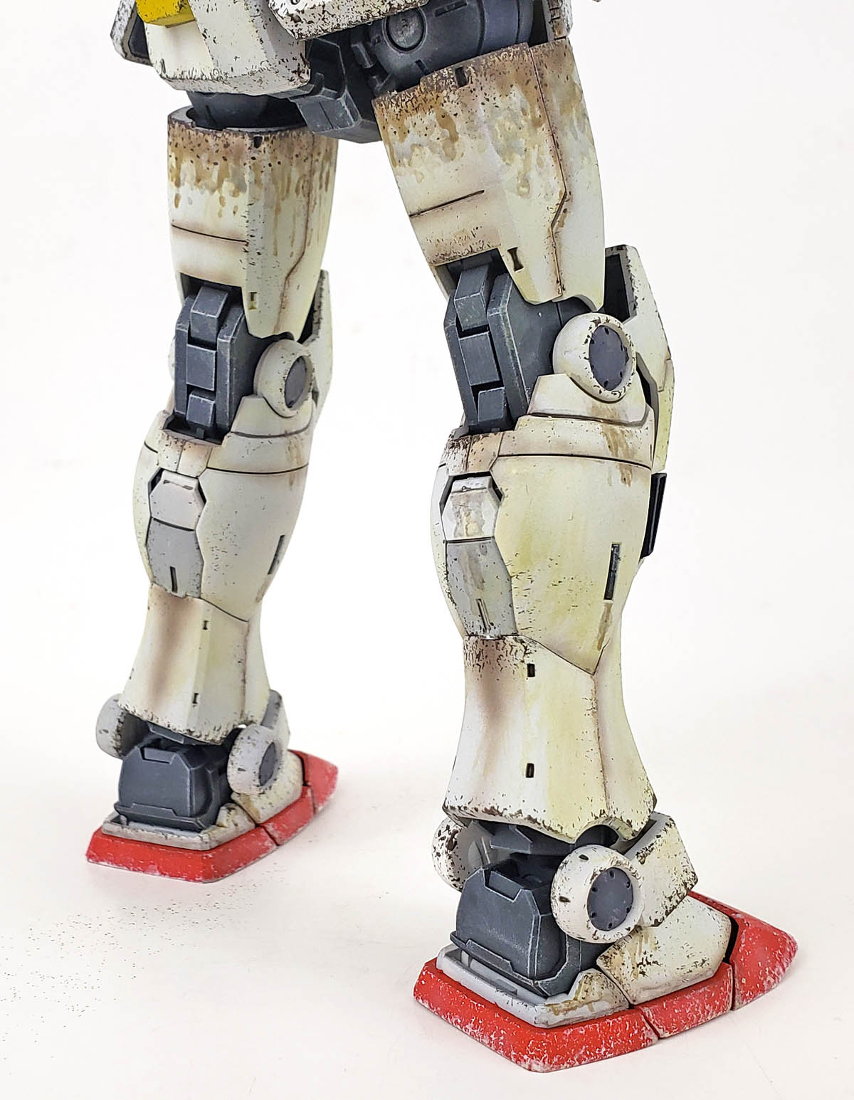
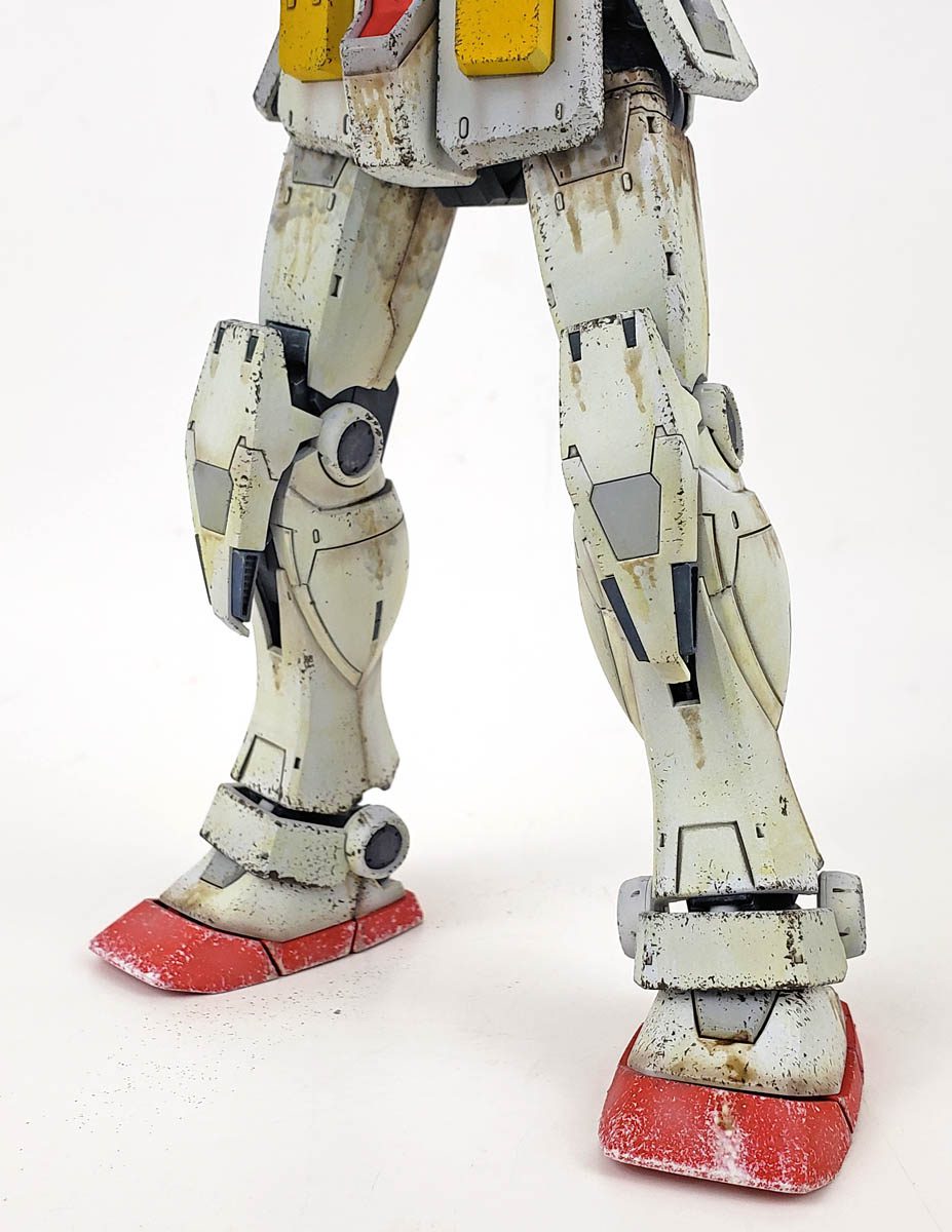
I started on the bright red “slippers” that make up the lower part of the feet, using Vallejo Mecha Color Offwhite. I worked from the corners in, almost “slicing” it into sections. The four corners of each foot were chipped, then the point halfway between those corners, and so forth. While this is not terribly random, I’ve realized my mind simply does not do random well. I have learned to build in randomness through order, if that makes sense. (It does in my mind…)
It’s almost as if I establish a set pattern, and then use tactical application of more chips to break that up. The overall goal, of course, was for the lower part of the feet to establish the heaviest chipping on the suit – everything from there had to be less dense.
Other parts of the suit were chipped with the same color – the waist and chest and the shield principally. The shield was given a bit of a heavier dose of chipping, as the assumption was that its employment as a defensive barrier would mean more abuse.
Dark Chips
For the dark chips, I used Vallejo Mecha Color Chipping Brown, again applied with the sponge. I continued to try to restrain myself from going chip happy. Starting by lightly chipping the upper part of the suit. I could then use it as a comparison of this section with the heavier chipped feet as a reference for the degree of chipping in between. It sounds a bit complicated, but fortunately the aforementioned monkeys and llamas are very good at keeping track of my thought processes. 🙂
Don’t Forget The Wear
With both chipping colors, I also tried to keep in mind where patterns of wear would produce a more pronounced effect. While the debris battle might produce light dings and scrapes along the overall armor surface, areas where to armor sections met might produce greater chips. This could be a result of the pieces clanging together in high impact situations, or as the result of maintenance crews handling those sections during periods of refit.
Additionally, that extra wear helps bring out and accentuate detail, which rewards the viewer with a better picture of the detail.
Time For The Grime
After the chips, I began the process of applying the grime and stains.
On some Gunpla, I deliberately tried to replicate the look of Earth-based fighting, adding dust and dirt effects around the models. However, I wanted this one to take on more of a “space-based” look, with an absence of dirt. So the focus was more on various fluid stains.
A Departure Into Fluid Dynamics
Now, I am no… err… Fluid Dynamacist. Or whatever you call someone who is an expert in that field. However, I am a modeler… and that means I can make wild assumptions with the assurance that if it works in my mind, it must be correct. 😉
One of the assumptions I’ve always made is that despite these mobile suits being super futuristic, giant nuclear powered stompy fighting dealies, the effects of physics do not change.
Anytime fluid is placed under high pressure, it wants to escape its container. I learned this at a young age, as did my little brother, whenever he asked me to hand him a can of Coke. I helped him with a science lesson of how vigorously shaking the can, and then opening pointing it at his face and opening it, resulted in hilarity as the fluid dynamically escaped the can through the small opening, depositing itself on my brother. (Which may be why he has a PhD in history, not science. Far less messy.)
Can We Return To The Model?
Right. Good. Of course.
Big stompy robots have loads of hydraulic devices underneath their armor to make them work. And all of the jumping and running and crashing about they do must of course produce huge amounts of pressure in those mechanisms. And I don’t care how futuristic man may get, things are going to leak fluid. Big things – like Gundam – will leak lost of fluid.
Some may be oil, others may be hydraulic in nature. Yet even other stains may be some super futuristic fluid of a nature we can only speculate on. And if you’ve ever seen any vehicle with fluid stains, you know those areas attract dirt and grime.
Adding Some Actual Stains
With that in mind, I began adding stains. For this process, I used several products from Vallejo Weathering Effects line. I didn’t so much think about whether a color was fuel, oil, hydraulic fluid, or something else, but rather I wanted to work with contrast. So I used a very dark color, a medium/dark brown, and a lighter red/brown.
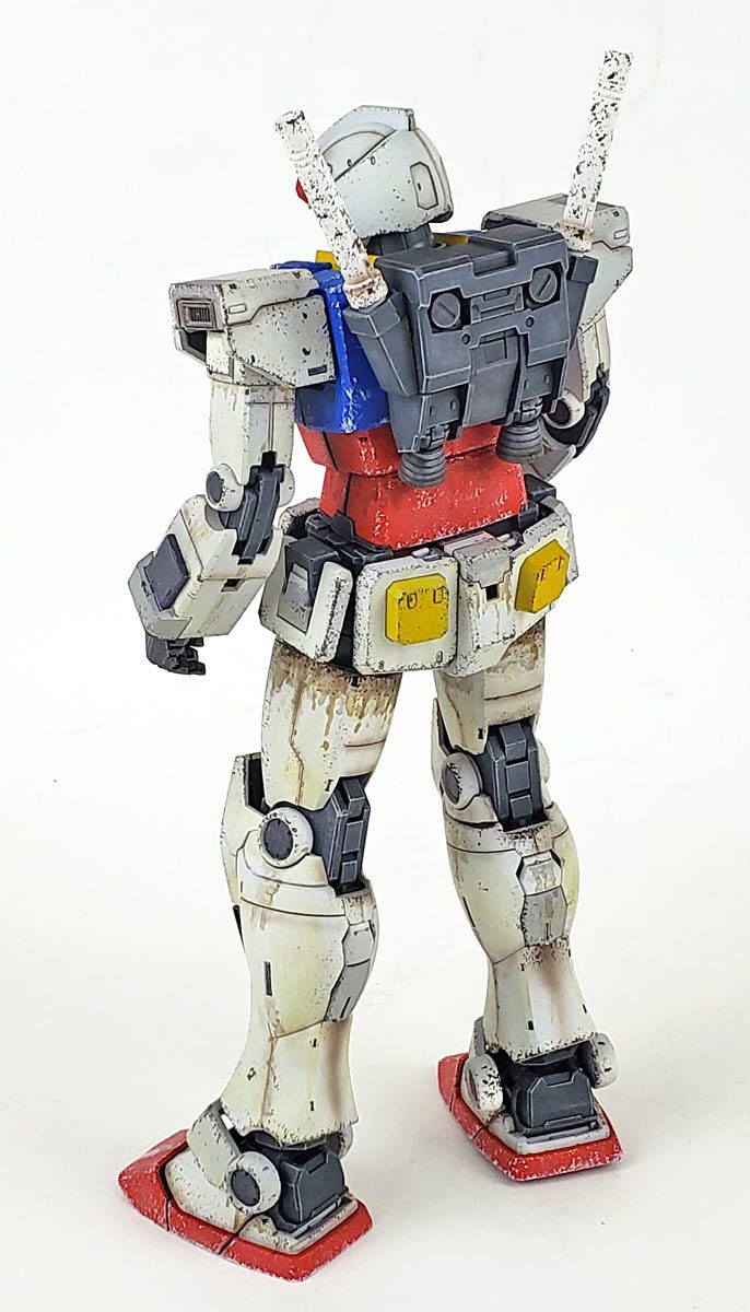
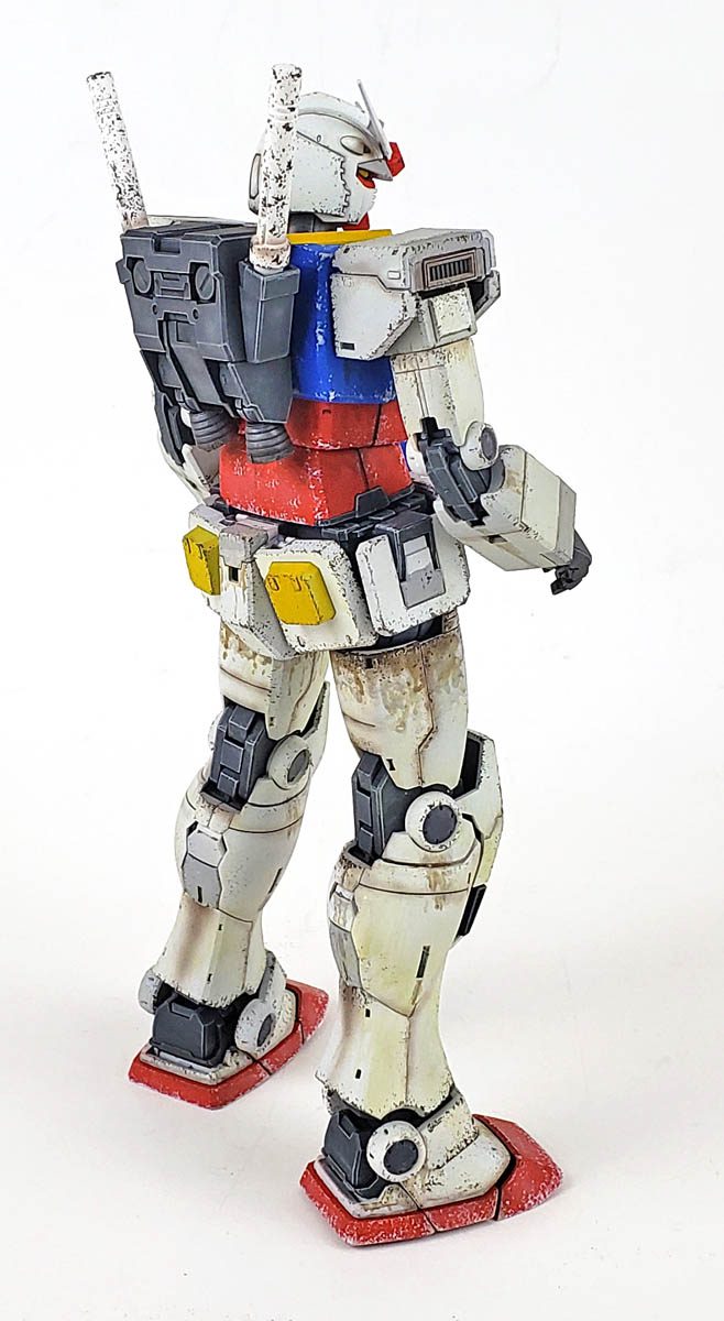
I started with the lighter staining color, applying it in places I thought would receive the most logical leaks. The most obvious place, in my mind, was the upper legs. These areas would be under tremendous pressure from all the running and jumping and so forth, thus producing the greatest staining.
Color was diluted with water, then dabbed, streaked, and stippled on. I worked around the suit, trying to not only pick logical areas, but occasionally adding stains they may not be logical – but could evoke a storyline within the viewers mind. Working from light to dark, a few more were added where I thought additional contrast was needed.
I was pleased with the result, as I felt it gave some depth to the look of the model’s surface.
Final Steps
A few Vallejo Model Washes were applied next, highly thinned. I was working for a filter effect, and I felt it mostly achieved this. Light tan and medium brown were used for this. The goal was not to make the suit look dirty, but rather to impart a slight, varied, and somewhat random color shift to areas. I imagined these would result from everything ranging from exposure to the harsh effects of the sun, to flying through debris fields of space vessels and other mobile suits.
As I’ve pointed out in previous blogs, my work with all acrylic weathering is an ongoing experiment. I liked how the acrylic filters worked, though it also made me realized I still need to work at it a bit more to make sure I have a good grasp on proper application.
The final weathering step was some airbrush effects, using a highly thinned mix of Tamiya’s NATO Black and Hull Red. This color was used to introduce smoke effects, add panel staining, and just generally blend some of other stains together. It’s a very versatile color, and I really like how it looks.
With those steps completed, a final matte coat of Vallejo Mecha Color Matt Varnish was applied.
In Closing…
I really enjoyed this model. The only real vice I found was the hands. They are amazingly cast as a single piece, yet once cut from the sprue, can be articulated. However, they seem a bit fragile. In posing the model for photography, some of the fingers would pop out of their joints. While the design allows for great flexibility of pose, I find I much more prefer the fixed variety, which normally includes optional parts for holding, open, and fist looks. In many ways it reminded me of the old “GI Joe with Kung Fu Grip” from my childhood. The idea is cool, but eventually you end up with a bunch of Joes with no fingers.
Still, that is the only complaint.
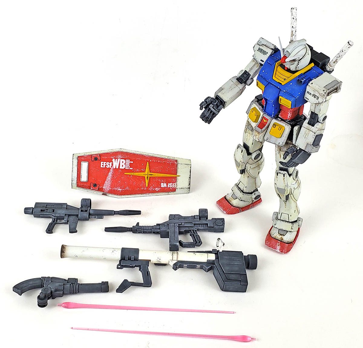
The suit looks great, has nice detail, goes together with no problems, and contains quite a number of cool accessories. If you’re looking to get into Gunpla, or to build a first Master Grade kit, be sure and check this one out.
I’m happy with how “Gramps” turned out. The RX-78-2 is the mobile suit that led the franchise off from the beginning. Ever since that time, some variant that alludes back to it is included in every Mobile Suit Gundam anime series. And while those designs may vary slightly, each in some ways pays homage to the one that started it all.

Leave a Reply